01 / Define
Start with foundations and states
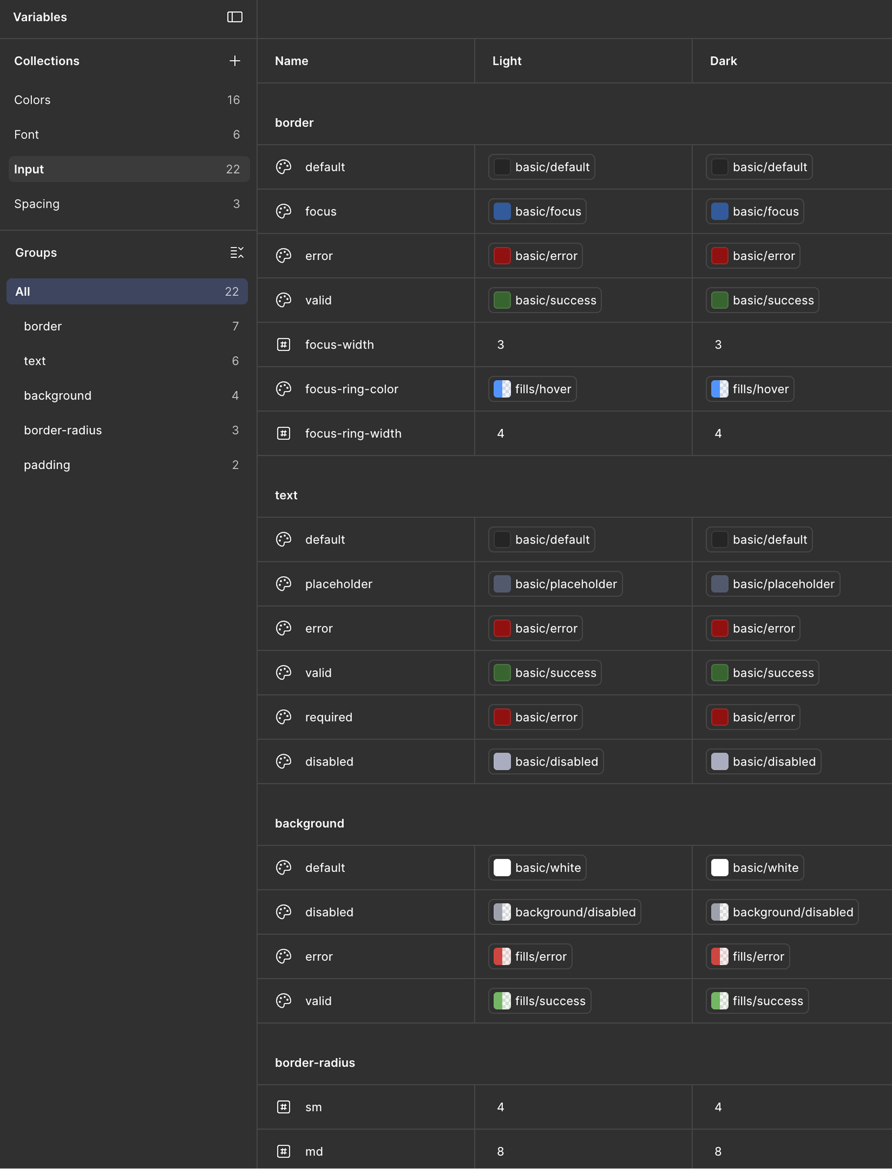
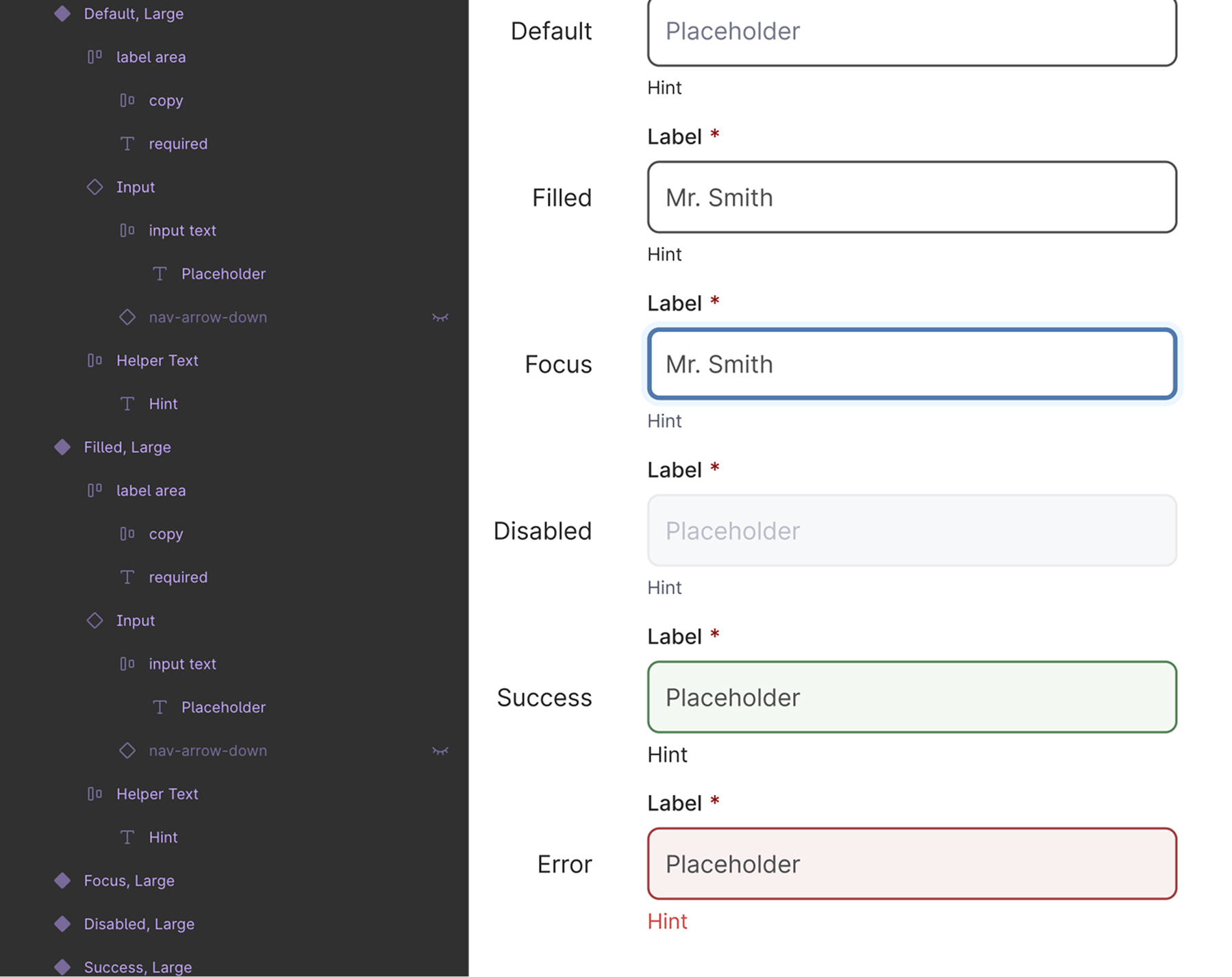
Figma variables hold shared values across light and dark modes. Components make important states visible early, including focus, disabled, success and error.

A working design-system exploration developed alongside Fleet’s geoscience products, bringing reusable interface patterns, data-heavy components and interaction behaviours into a shared implementation.
The production design system spans about 2,400 components. This interactive example shows a small, selected set of patterns, and how I worked across design and code to establish them as the product evolved.
How the system works
The library is connected to the way the product is designed and built: variables and component states inform implementation, while clear documentation makes patterns easier to reuse across a much larger system.
01 / Define
Figma variables hold shared values across light and dark modes. Components make important states visible early, including focus, disabled, success and error.
02 / Check
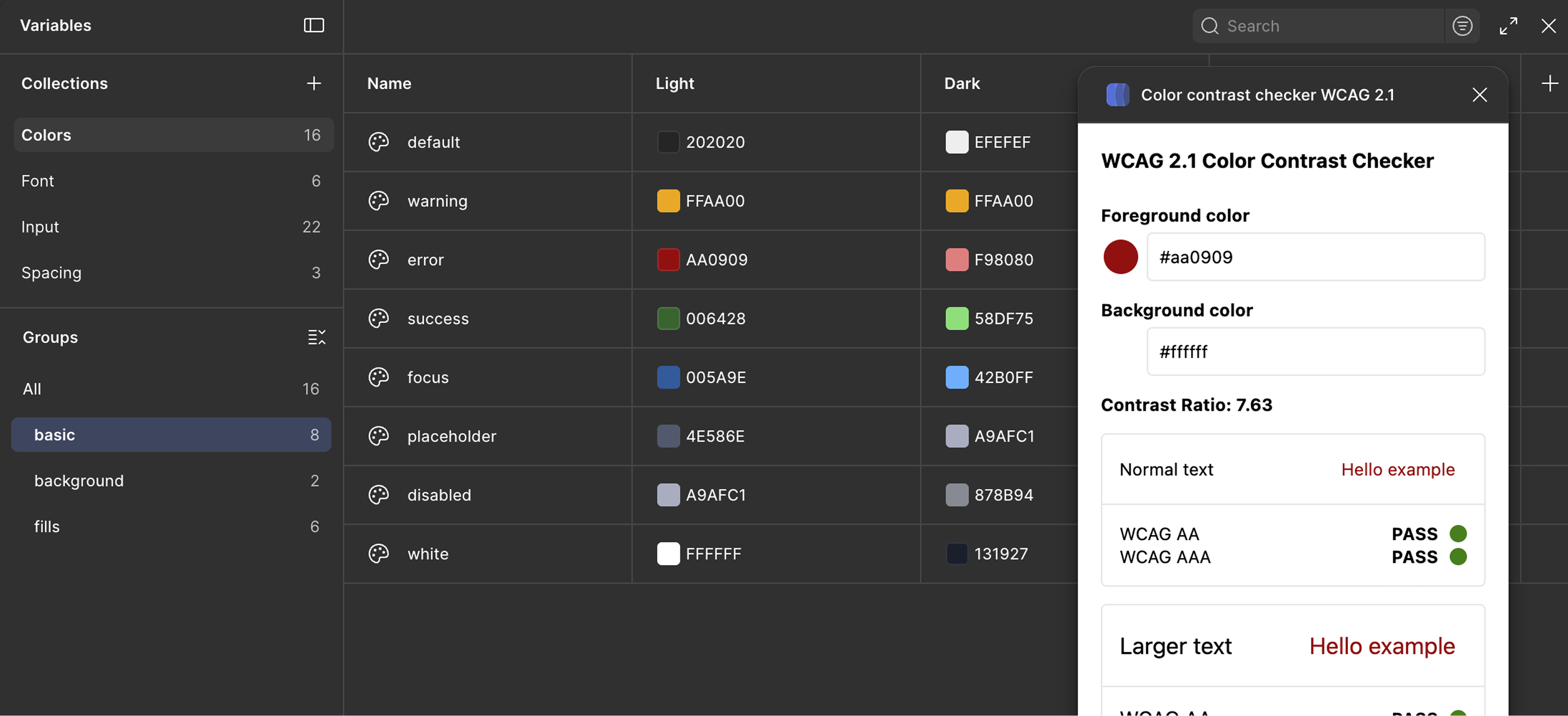
Check colour pairings as the palette and semantic variables take shape, so contrast issues can be resolved before those choices reach implementation.
03 / Implement
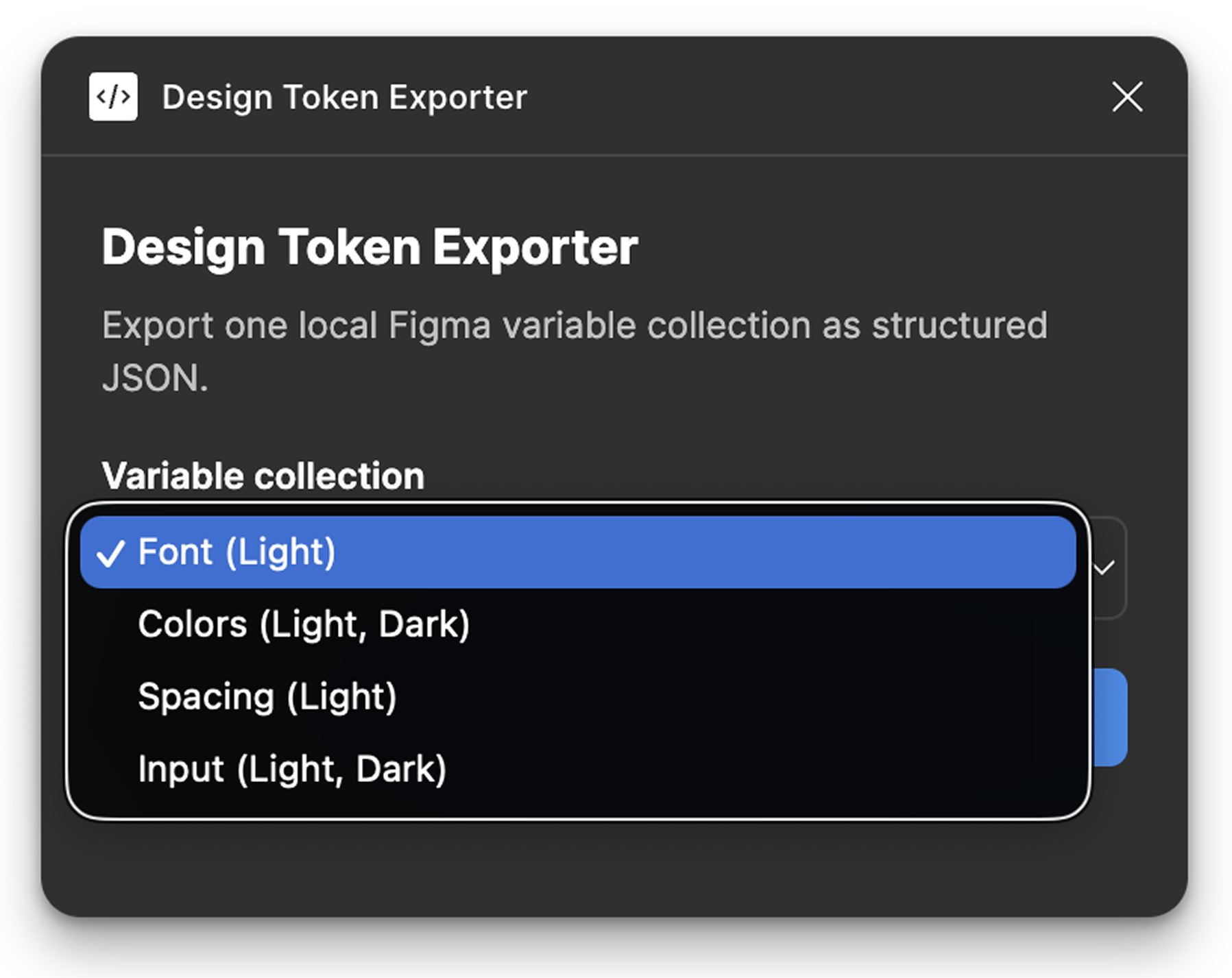
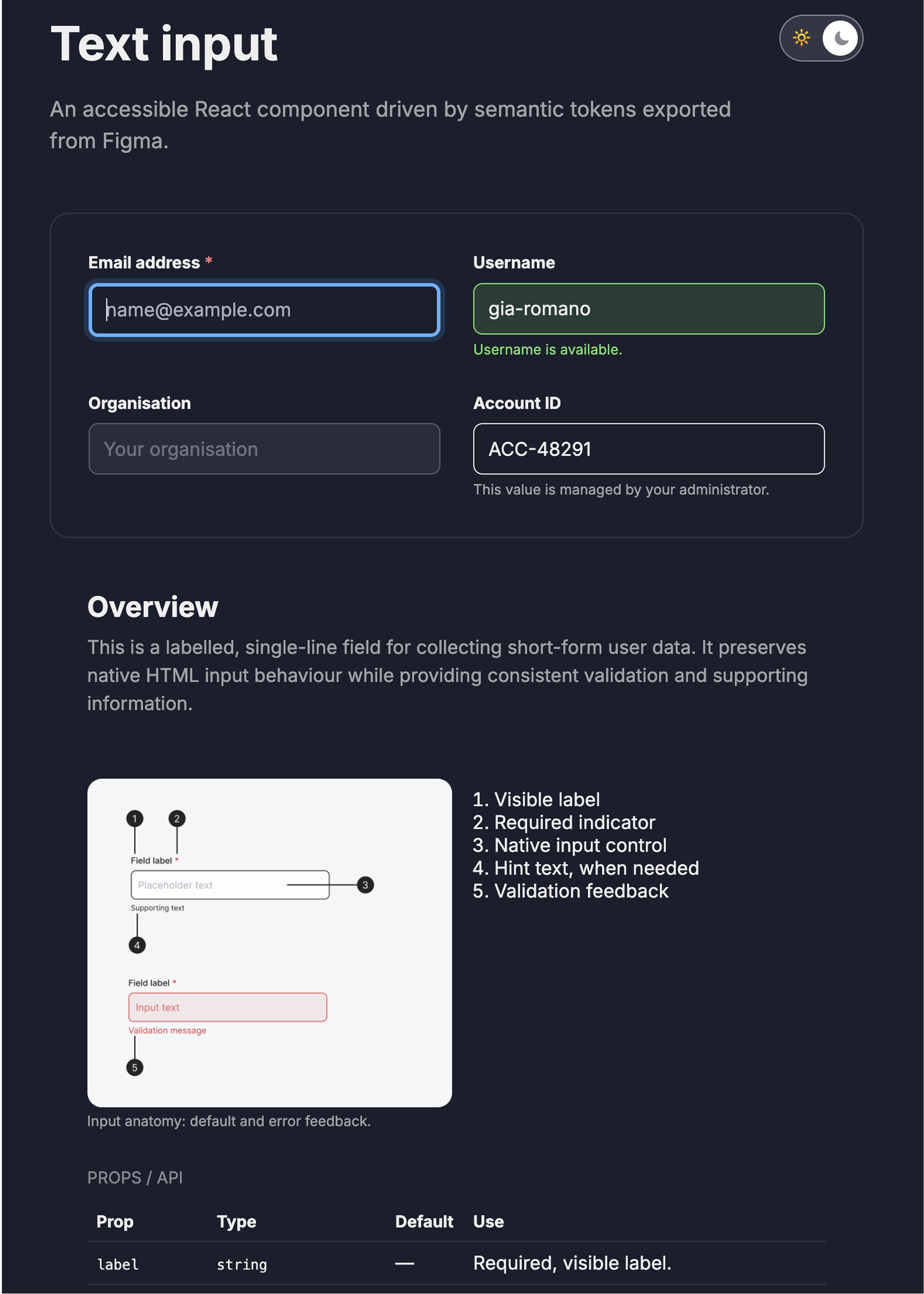
A Figma plugin exports variable collections as structured JSON. The implemented input then applies those tokens to a real, accessible React component.
04 / Document
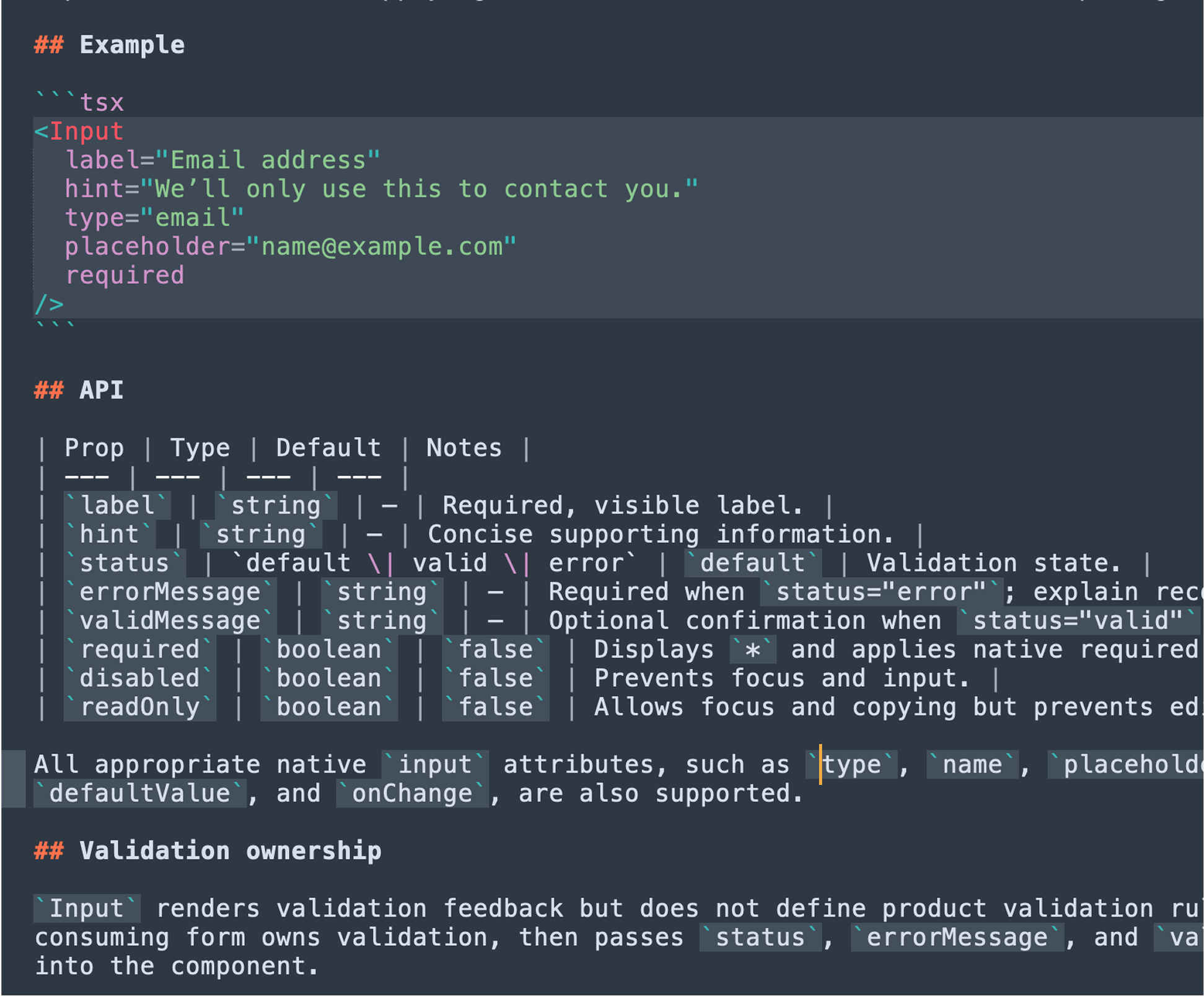
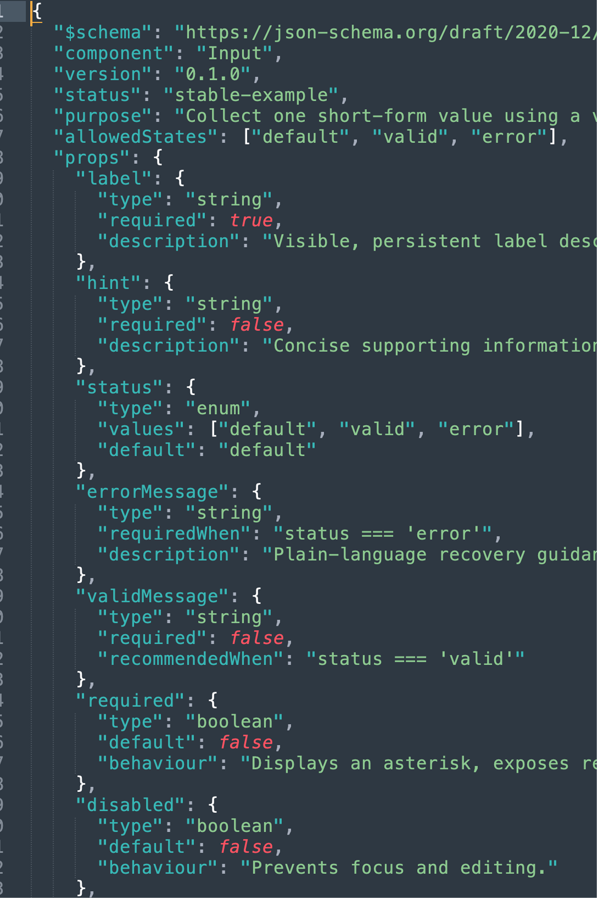
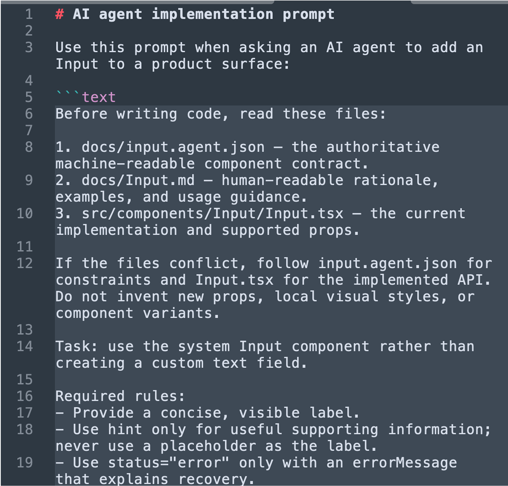
Human-readable guidance explains use and validation ownership. A machine-readable contract records the supported API, and an implementation prompt points agents to both sources and the component itself.
The working result of this design and implementation process: a living, interactive reference for selected components, their states and usage guidance.
Selected examples only · The complete production library contains about 2,400 components.