TradeWindow Product Design
TradeWindow leverages software and industry expertise to provide more visibility and control, with the tools and support for exporters, importers, freight forwarders, and customs brokers to move away from inefficient trade processes and begin the journey to digital transformation, streamlining business processes and driving profitability.
What we were tasked with
I used my visual, interaction, and research skills to help TradeWindow to attain a product-market fit and scale its offerings. I then focused my attention on establishing, growing, and leading the UX discipline.
I designed a major version of TradeWindow’s provenance app as the product design lead. I helped reduce transaction and operational costs by providing greater user agency and control through design. I then built and managed a team of product, communication, research, and UI system.
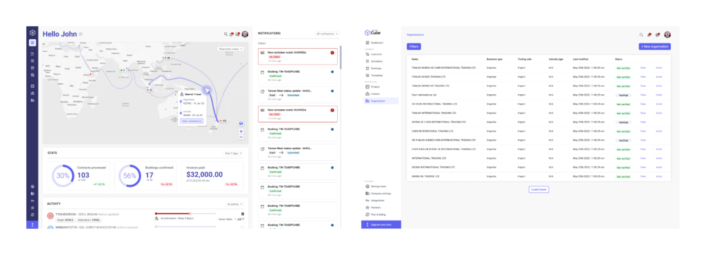
I cannot show the majority of work I did at TradeWindow because of proprietary concerns. Below is a sample of some of the projects I directly worked on while leading design at TradeWindow.
Research
Focusing on user research
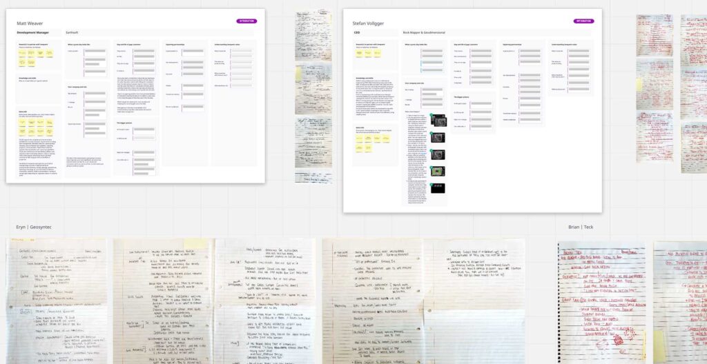
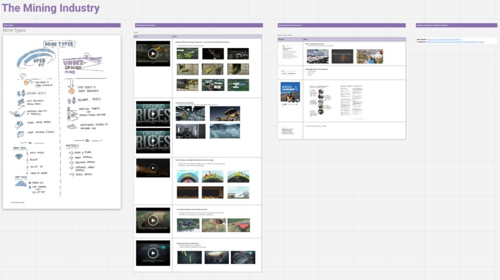
User research is crucial at TradeWindow because of the complex workflows of the many user types that must be accommodated to make the system work. One of the first things I did at TradeWindow was to get out of the building and interview clients.
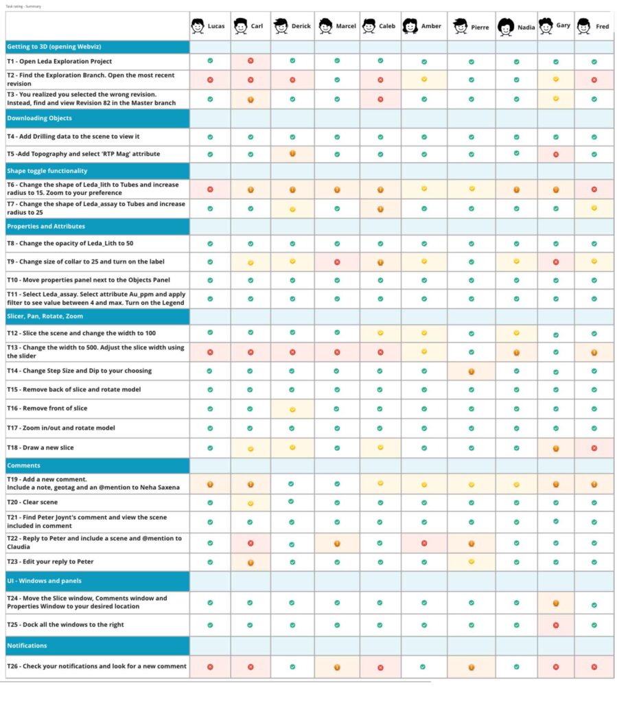
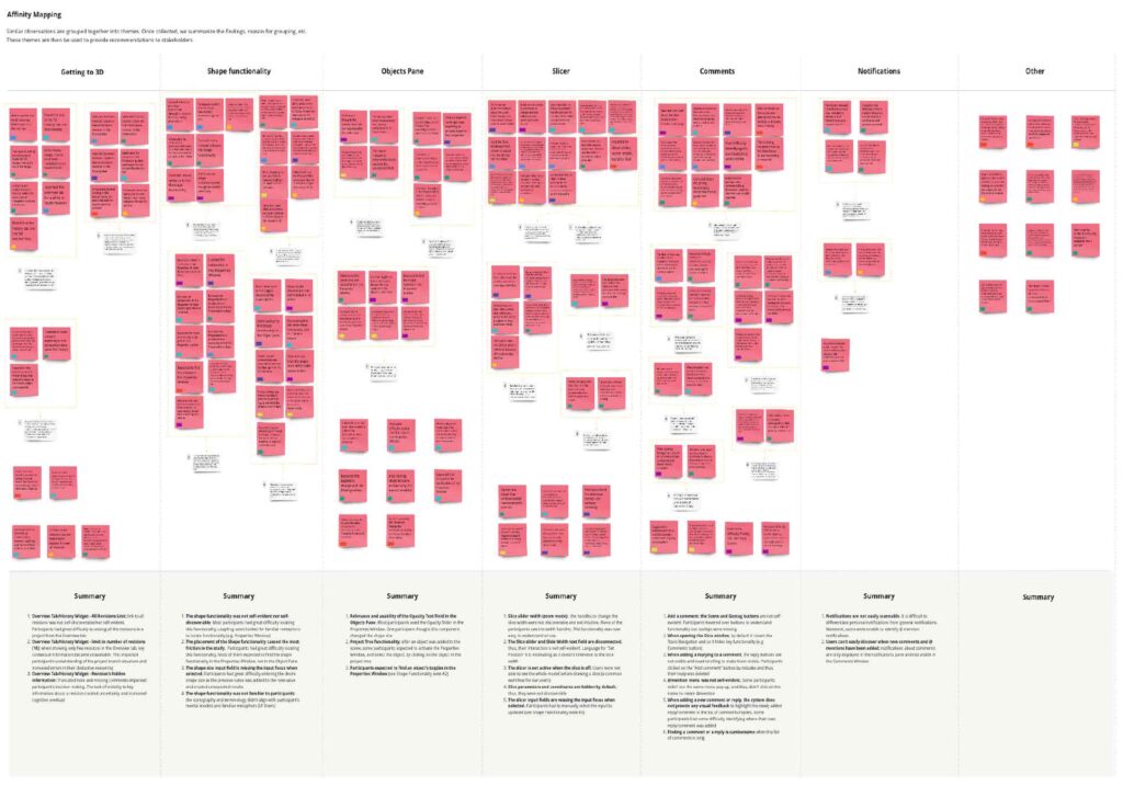
I conducted user research sessions to derive product insights. I employed user interviews, contextual inquiry and analysis, persona development, card sorting, etc.
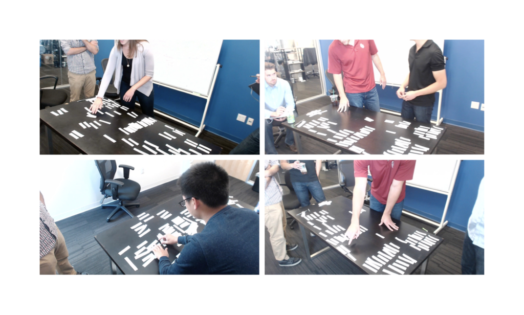
User Interviews
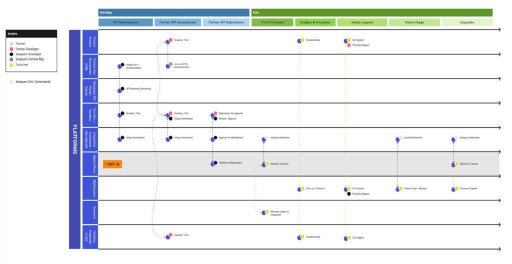
One of my most significant insights from interviewing and observing the many people comprising international logistics was that no one knows it all. Each knowledge worker has a depth of subject matter expertise and knows enough about adjacent roles to get their job done.
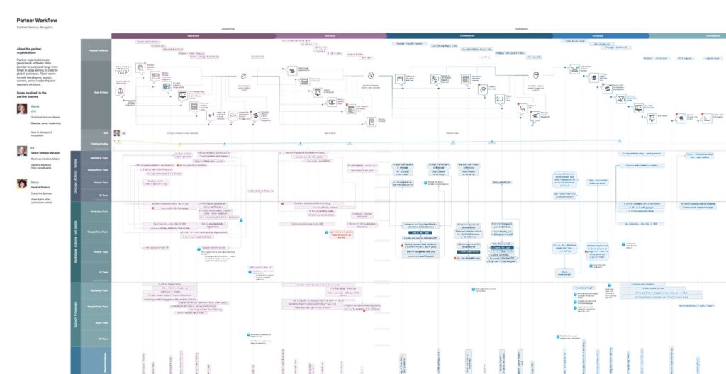
This insight drove the product design architecture of our system, connecting the dots between each user type. Instead of just designing for a primary user type and accommodating secondary types, each product designer builds for the intersection of a diverse chain of roles.
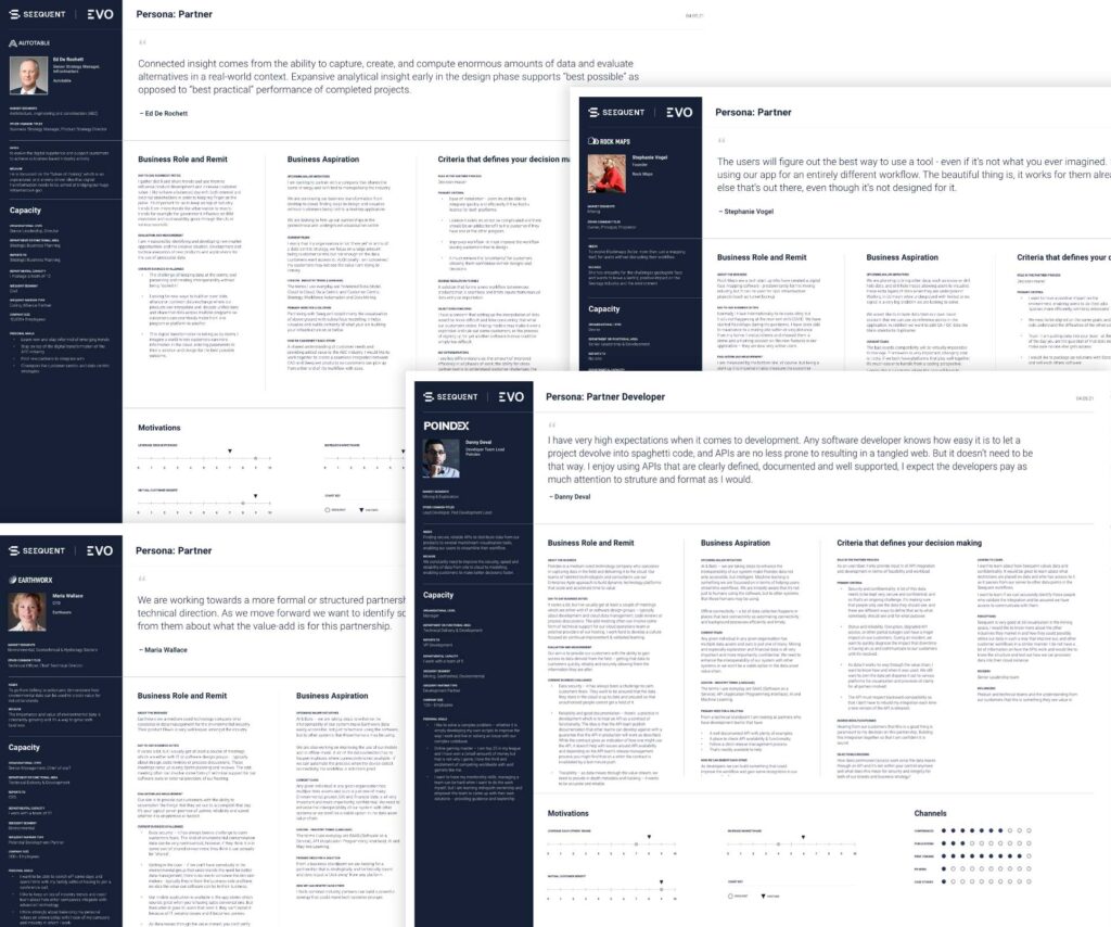
Personas
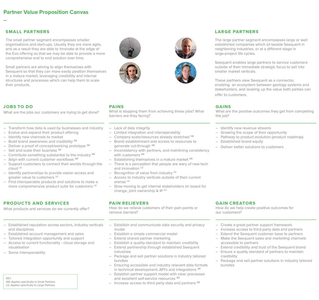
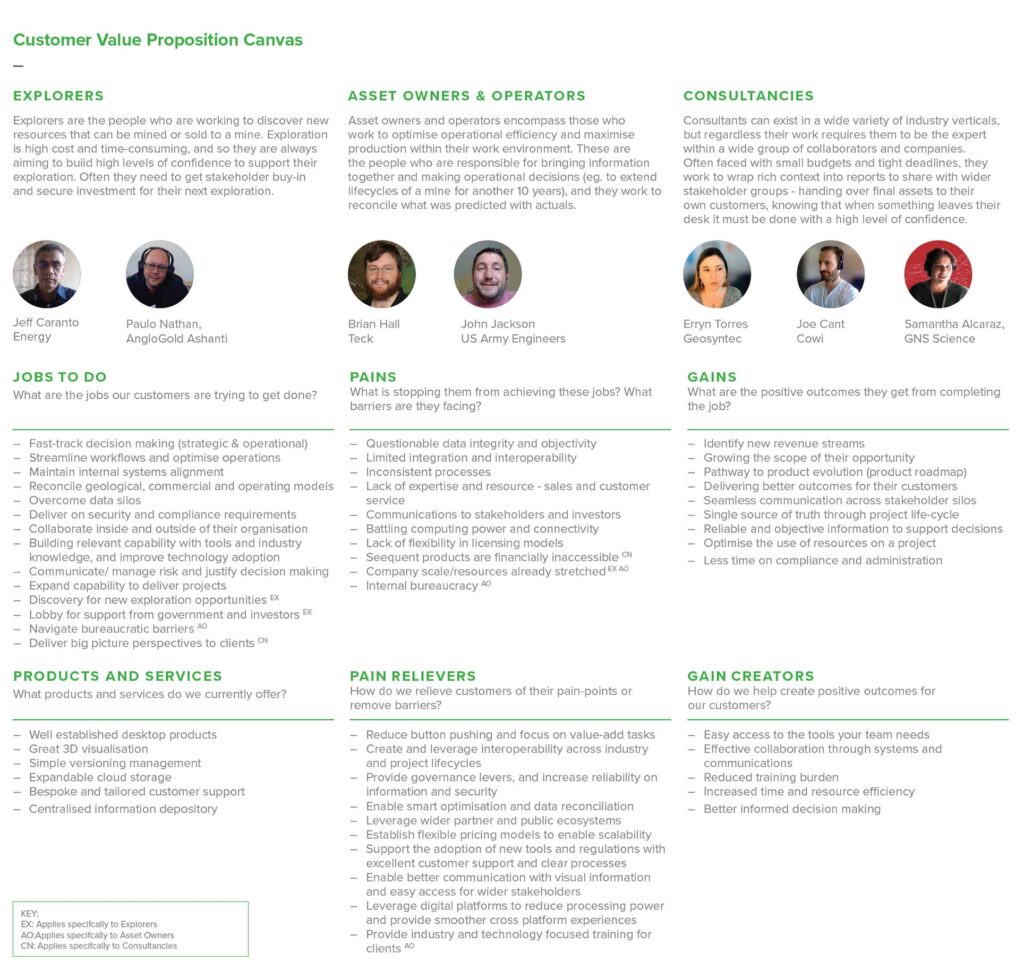
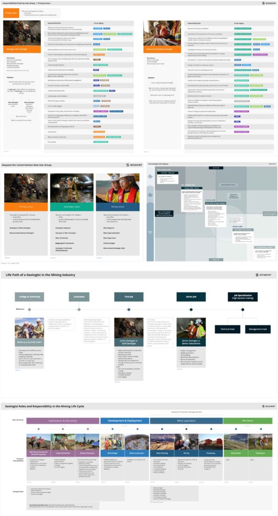
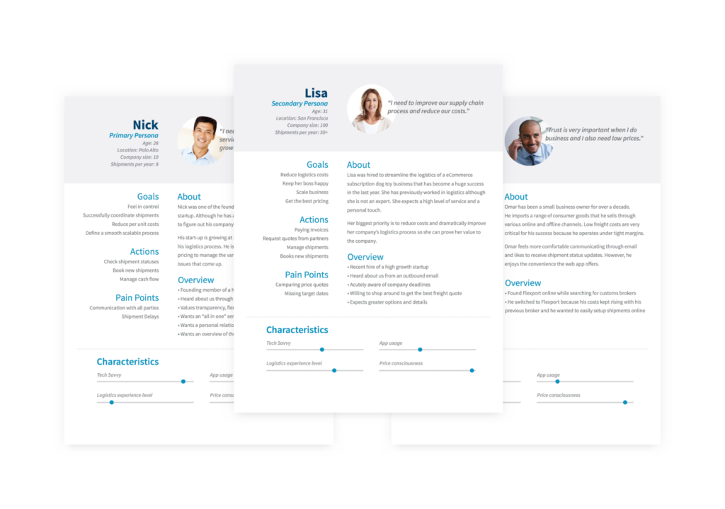
After we transcribed the interviews, segmented the audiences, we derived personae from the individuals that stood out as the main segments in each of the specified audiences.
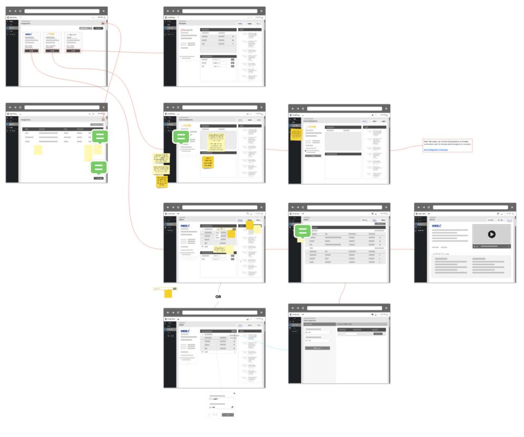
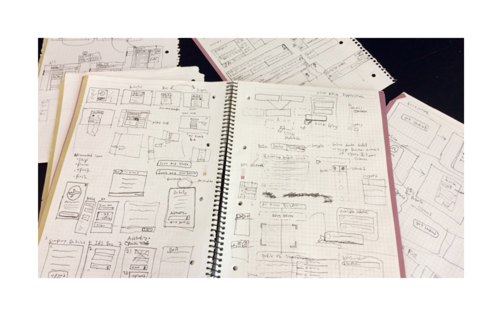
I started the project by reviewing all the known requirements with the product team. We agreed on business and user goals and began examining the common onboarding issues. I started to sketch ideas, while the product team further defined all the exceptions and unknowns.
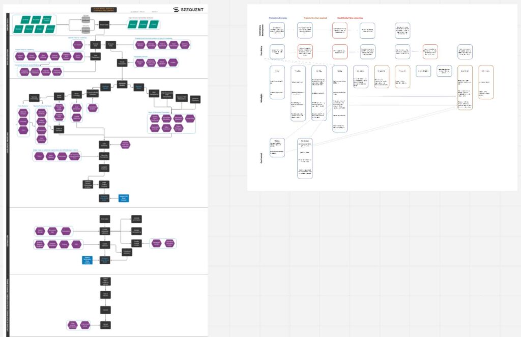
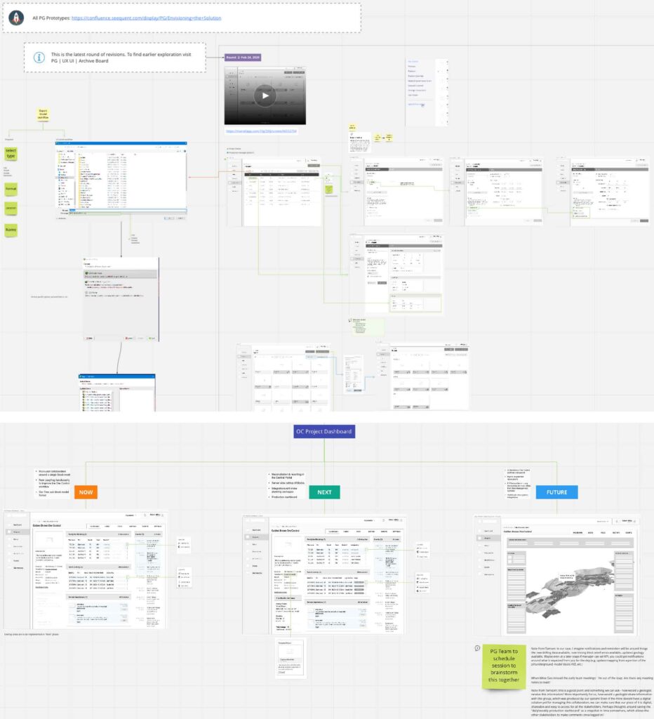
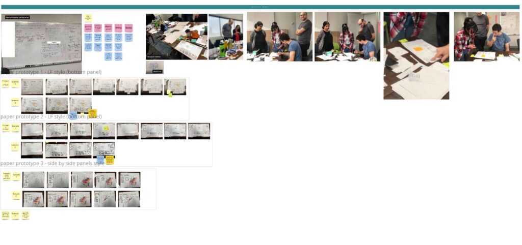
We performed task analysis and defined the conditional flow. I then created a low-fidelity prototype and began to conduct usability tests.
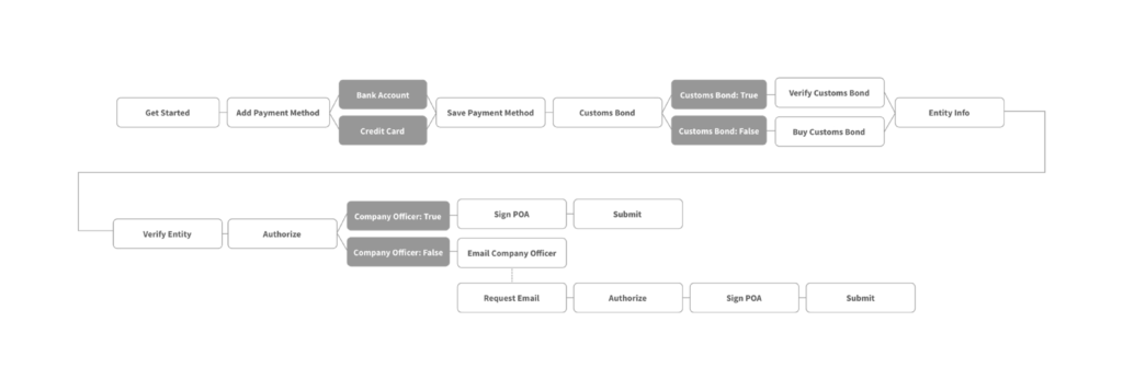
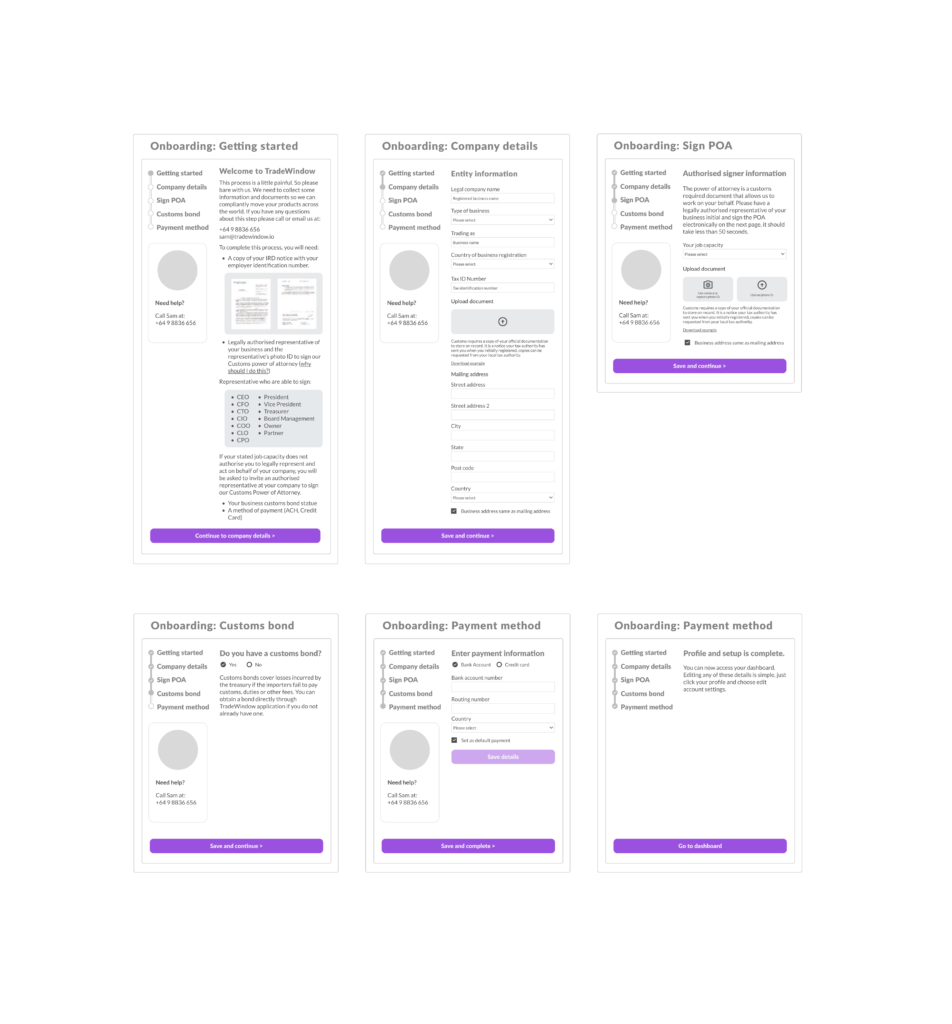
I iterated the design based on insights from usability tests, as well as new requirements for exceptional cases (ex. what if the user is apart of another organisation and doesn’t have access to key documents?).
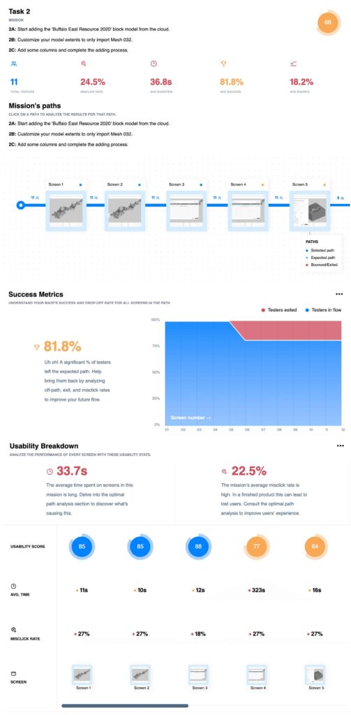
I then created a high-fidelity prototype and conducted additional usability tests. Once we had high confidence in the new design, we began implementation. We then made countless tweaks to the compliance onboarding flow after its launch to accommodate unique use cases.

Business outcome
The redesign decreased friction by orders of magnitude. Before the redesign, the majority of users needed help from customer service to complete the process, and unique situations were facilitated by our internal teams.
The new design enabled users to become familiar with usability in a matter of minutes with a stepped process that accommodated many diverse company types through conditional flows. The redesign helped us to serve clients that were previously unprofitable due to onboarding costs.
View Project