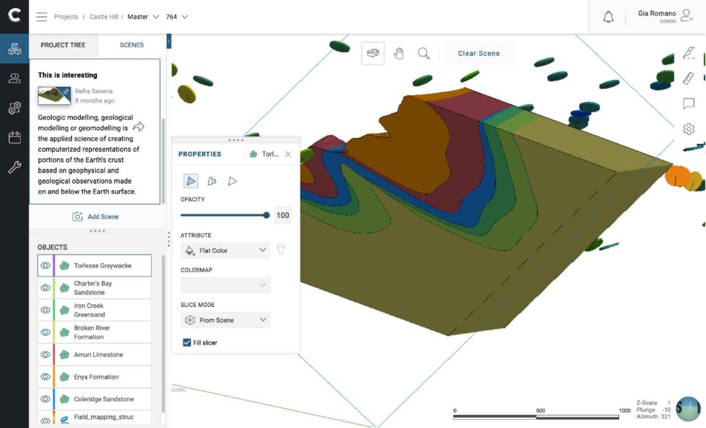
Web Visualisation
Within an open cloud-based environment of solutions connected through seamless integrations, mining companies will be able to bring together data, services and applications in real time. In the past, 3d modelling software was best suited for desktop applications, files were large and required inordinate amounts of processing capability. Through extensive R&D, our team is working towards bringing this technology to the cloud allowing users to open and interact directly in a web browser, wherever they are and with no training required.
What we were tasked with
Design an interface where users could; access data and revision history in 3D, interrogate it using intuitive tools, manage access with detailed permissions and collaborate with shared views.
Research
Benchmark
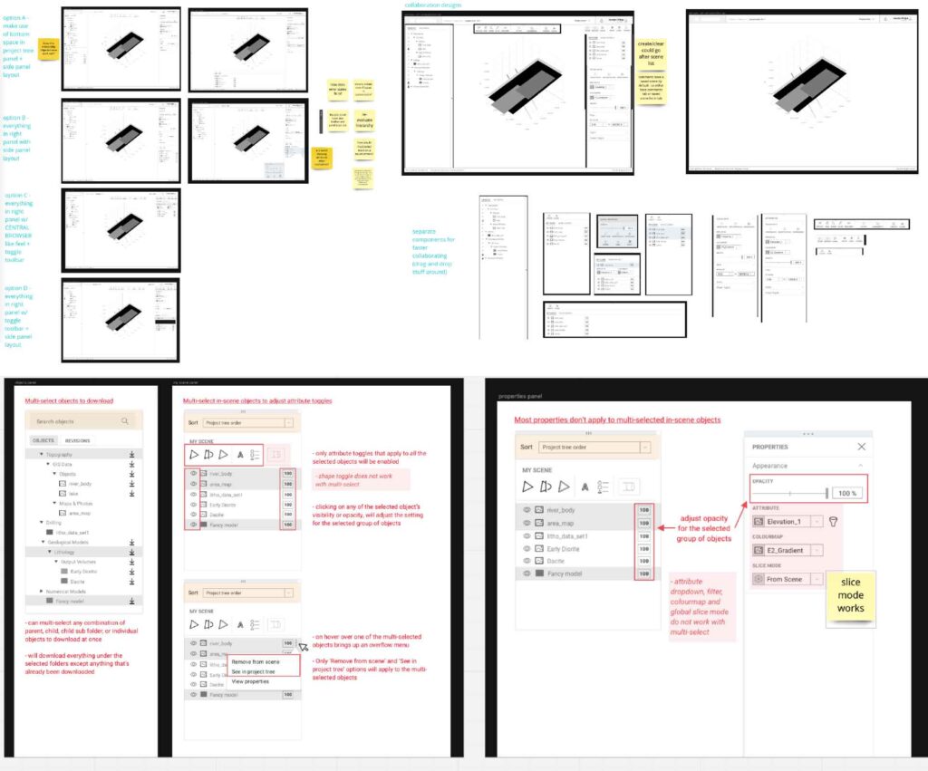
Researched and documented other 3D modelling cloud visualisation products as well as our desktop version for viewing models. Identifying inspiration from patterns/usability/ui by calling out patterns in the cloud and placing alongside the required features that are required to be ported from the desktop. As a result of migrating our desktop product to cloud we needed to document current patterns being used and identify if they could be improved.
Analysis
Workshops
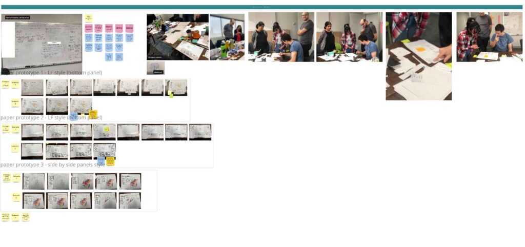
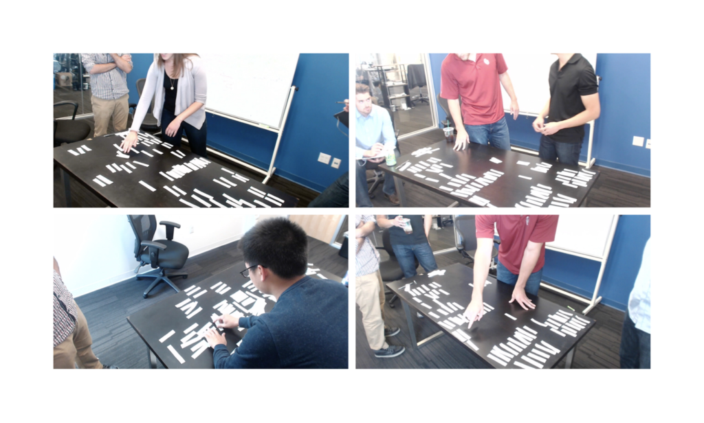
Using the desktop application as a base, we had a series of workshops with internal stakeholders and key customers to fleshout flows. We concluded with paper prototype session working collaboratively to build a set of loose flows.
Ideation
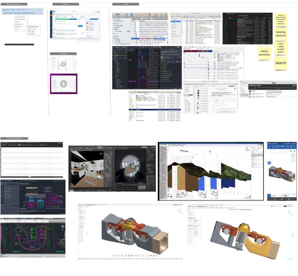
Wireframes
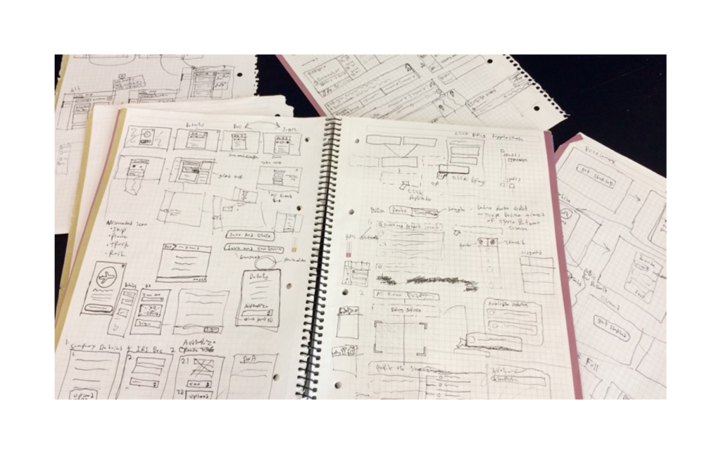
Created wireframe prototypes from the paper version with intention to test with key customers.
Ideation
Testing
Testing agreed tasks with a prototype and documenting the results. We tested both internally with support teams as well as a select group of large clients.
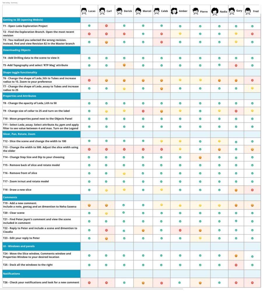
Findings
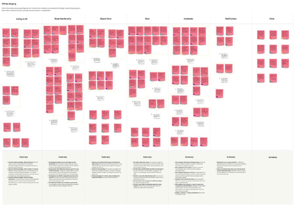
Organised changes into affinity maps by features to present updated prototypes back to the business for buy-in and move onto development.
Final Product
Final features were landed into the product and launched.
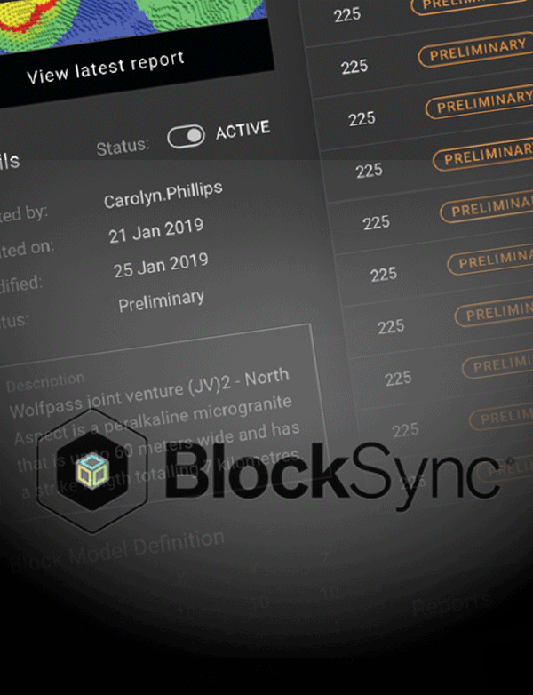
BlockSync
Models for mine planning are usually based on exploration information from an initial phase of the mineral extraction process. Real-time integration of this data via the BMI service into resource or grade control model allows for continuous updating and is able to provide estimates that are more accurate. Where the operation had previously performed manual calculations for grade control, using a cloud service that continually updates short-term block models vastly improved the accuracy and efficiency of grade calculation saving time, resources and overall environmental sustainability.
What we were tasked with:
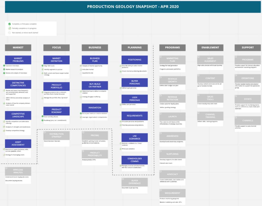
Our team was tasked with designing a cloud Block Model (BM) service that integrates with 3d geological models to greatly enhance the resource and production geology workflows. This included designing an interface for access to real-time grade control, revision management, cloud visualisation and reconciliation reporting. Built with extensible API’s to easily support partners and 3rd parties in the long term.
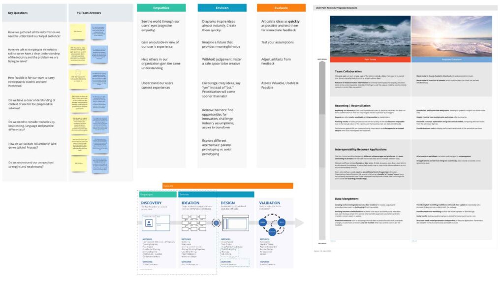
Our aim is to understand the end-users (current and future), develop context of use, flesh out goals and motivations by delivering artifacts to support short, medium and long term product lifecycle planning. I brought together a broad set of designers, product, engineering, and business to work through the problems, identify the opportunities and propose a solution that we’re continuing to test and bring to life for our users and present to leadership for executive buy-in. I also worked on creating a plan to work on a quarterly approach to bring to customers and gain valuable feedback through an early access program.
Research
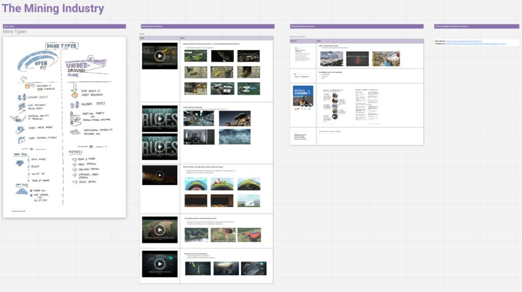
Learn about the industry in terms of production geology which is a very refined sector in the mining industry. The team started by interviewing internal sector directors and documenting our understanding of the process.
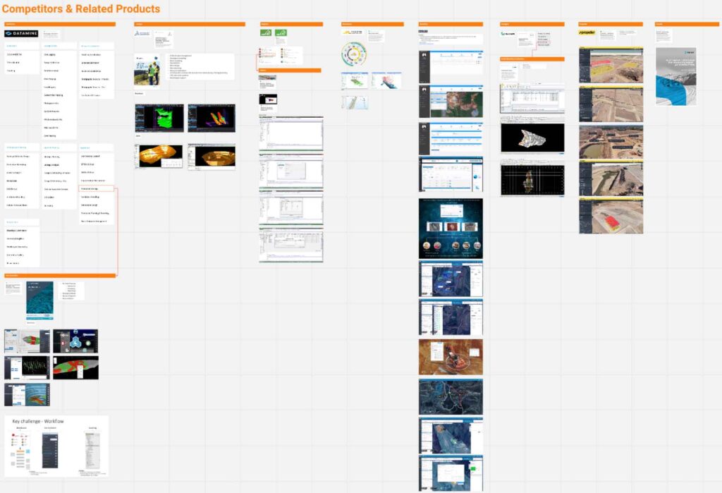
Competitor Benchmarking
We then reviewed competitors to understand the various desktop products that offer all or some of the tasks in the workflows.
Analysis
Workshop Planning & Execution
Internal workshops and meetings to establish and track process across the business, same principles to UX were applied within the business so that they learnt our process by example. We also created UX requirements & deliverables table to update what’s required and the status as the project progresses.
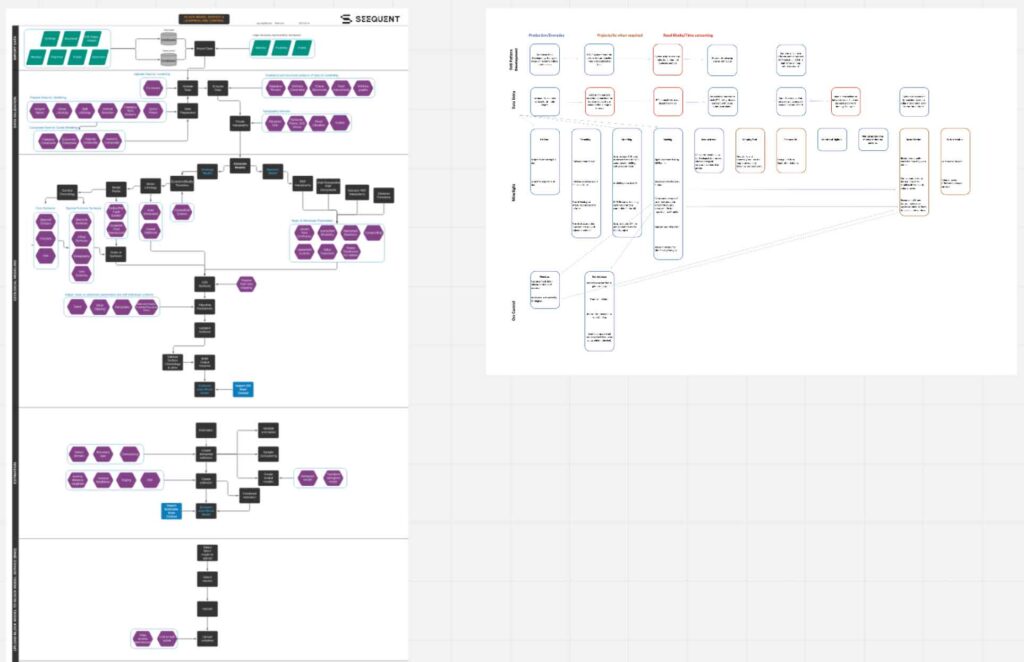
Workflows
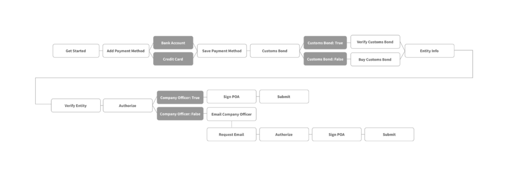
Documented the workflow from the research to provide structure for the task flows and user journeys.
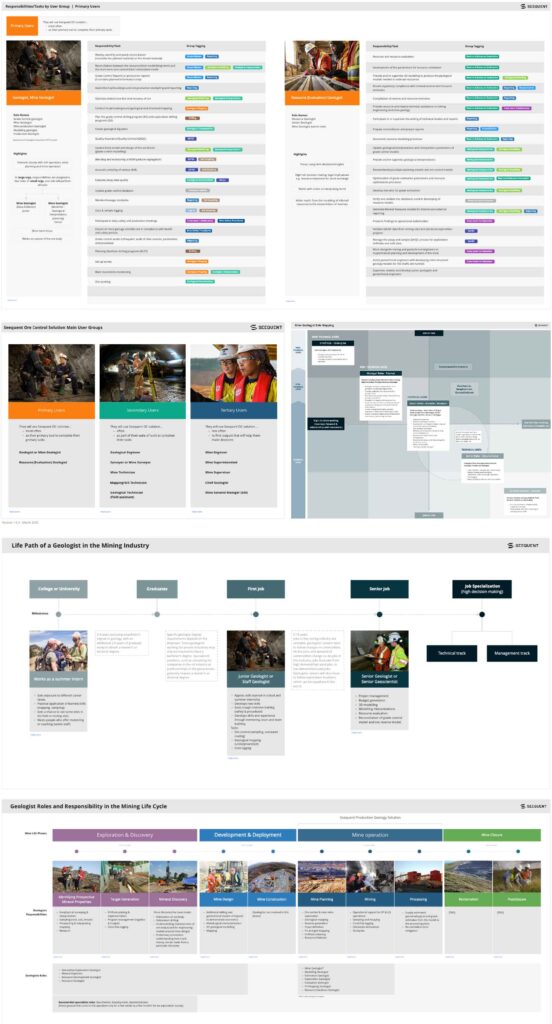
Define Target Audience
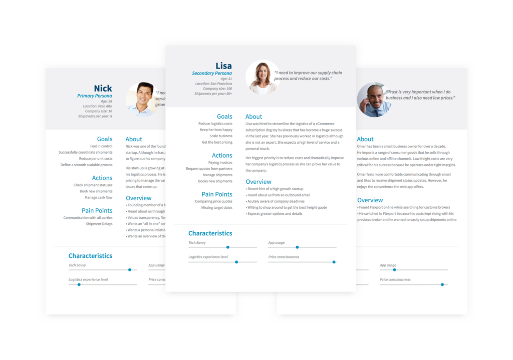
Create user types from the personas and interviews building artifacts that will help all teams design and develop for our end-users to understand who our end-users are (current and future) and gain cognitive empathy for them to learn context of use, goals and motivations for our end-users.

Ideation
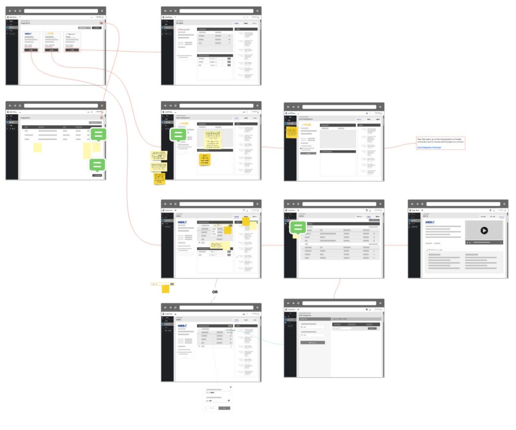
Wireframe & Prototyping
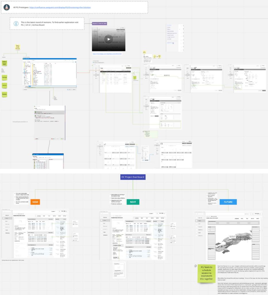
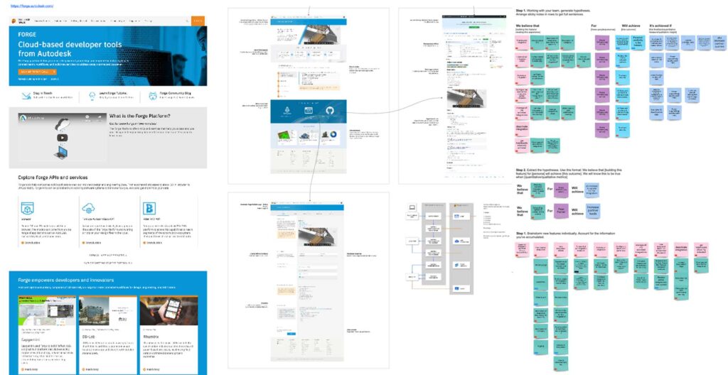
In order to visualise ideas and imagine the future, we explored options with wireframes and created lo-fi prototypes. Our intentions were to withold judgement and inspire creative to the current norm. We removed boundaries and barriers in order to find opportunities for innovation and challenge industry assumptions in order to improve old or traditional workflows.
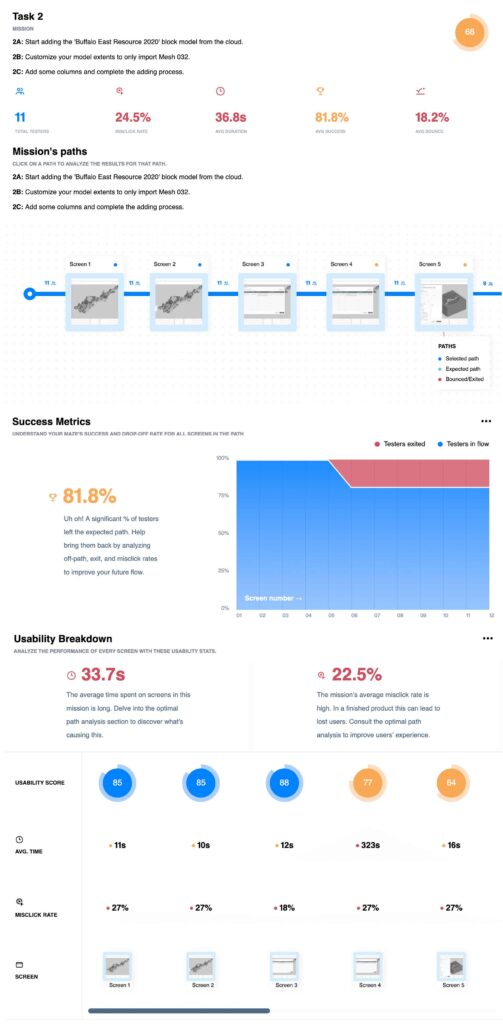
User Testing
After carrying out user tests, it is necessary to detect the improvement points, redesign the wireframes and test again. Using Maze, we were able to detect several points of improvement through painpoints and task failures. We iterated the design to improve the results.
Evo Product & UX Strategy
Evo is a vision for the future of geoscience software – spanning desktop and cloud applications, APIs, and exciting new micro-capabilities (like notifications and web visualisation). It is not just for geoscientists and engineers – it’s for data scientists, IT managers, developers, and stakeholders.
What we were tasked with
The Evo project kicked off on 9 February 2021 with a diverse, multidisciplinary, freshly assembled team spanning Christchurch, Auckland, Vancouver & Toronto. In the first 6 weeks we covered significant ground, challenged foundational business assumptions and identified opportunities that Evo, as a business, can capitalise on in years to come. My individual goals were to contribute to the formation of a business model and product strategy, define audience(s), formulate the UX plan for research, analysis and deliver prototypes for testing & production.
Research
Benchmark
Attain the benchmark from researching other API frameworks. What aspects stand out from good/bad usability, could we identify additional functionality and flow from these other like services & products?
Analysis
User Interviews
We engaged with diverse range of customers and partners, spanning industries, roles and areas of expertise. These one-on-one conversations use open-ended questions to elicit stories about specific experiences that help uncover unacknowledged needs. This protocol allows the interviewer to probe more deeply into stories than a more traditional interview.

Lead with empathy
Engage with diverse customers and partners, spanning industries, roles and areas of expertise to understand their aspirations, challenges and jobs to be done.

Desire first
In this approach, we unusually tackled the challenge of creating Evo from the desirability lens – using the needs of customers to provide objectivity and clarity in the business design process.

Assumptions to facts
To ensure objectivity and provide clarity, we set out to identify and define assumptions and replace them with facts through interviews and feedback with users.

Ecosystem thinking
Evo is an opportunity is to create an ecosystem that connects partners and customers and deliver a disproportionate amount of value to geology workflows.
Analysis
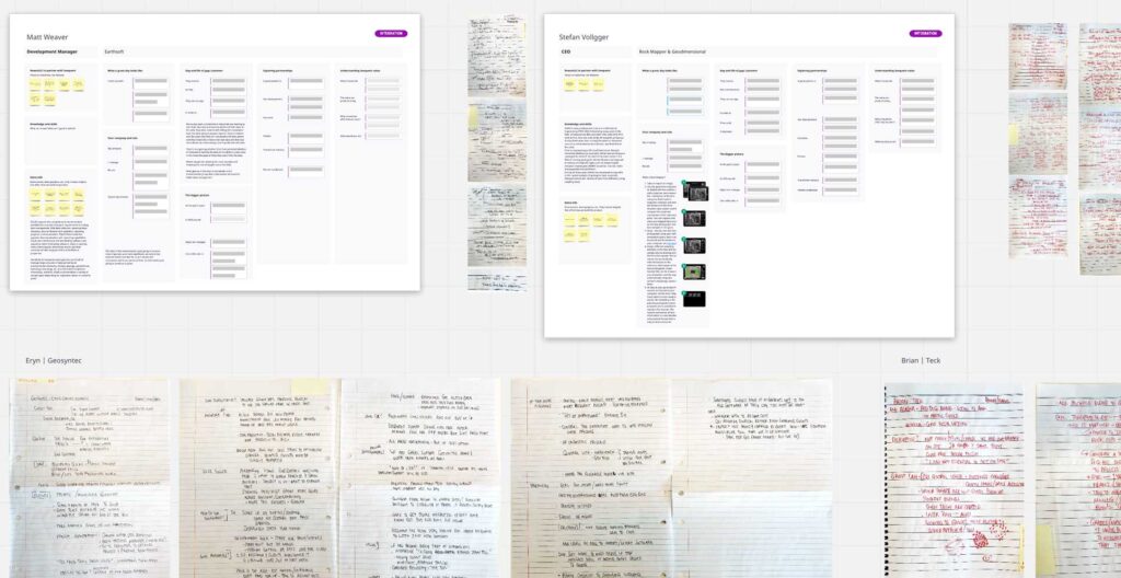
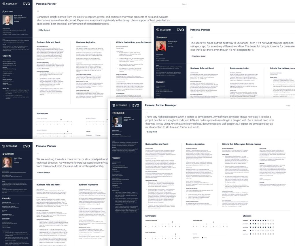
Personas
After we transcribed the interviews, segmented the audiences, we derived personae from the individuals that stood out as the main segments in each of the specified audiences.
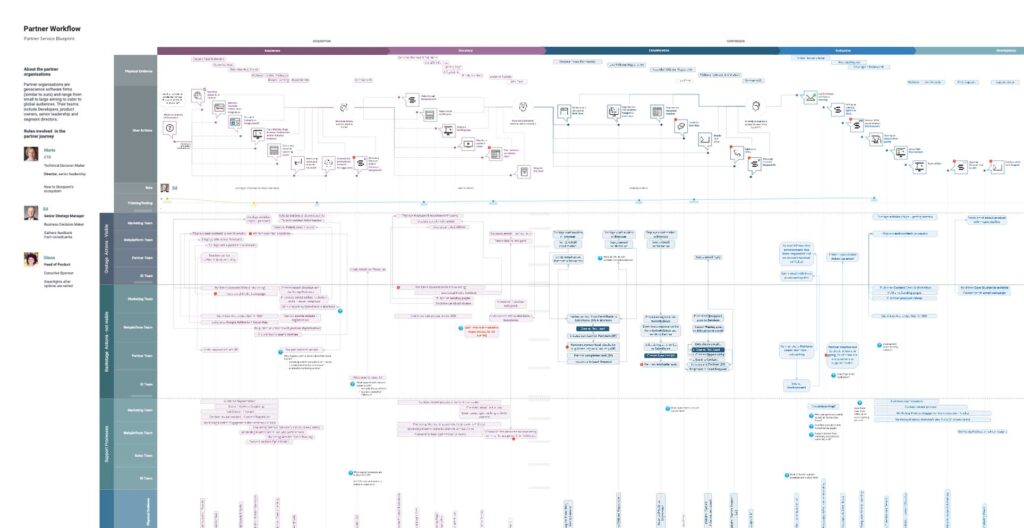
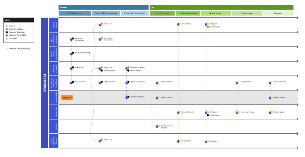
Workflow/Blueprint
With the following in mind:
- Identify the nature of the journeys customers take—from their point of view
- Understand how customers navigate across the touch points
- Anticipate the customer’s needs, expectations, and desires
- Set priorities for the most important gaps and opportunities
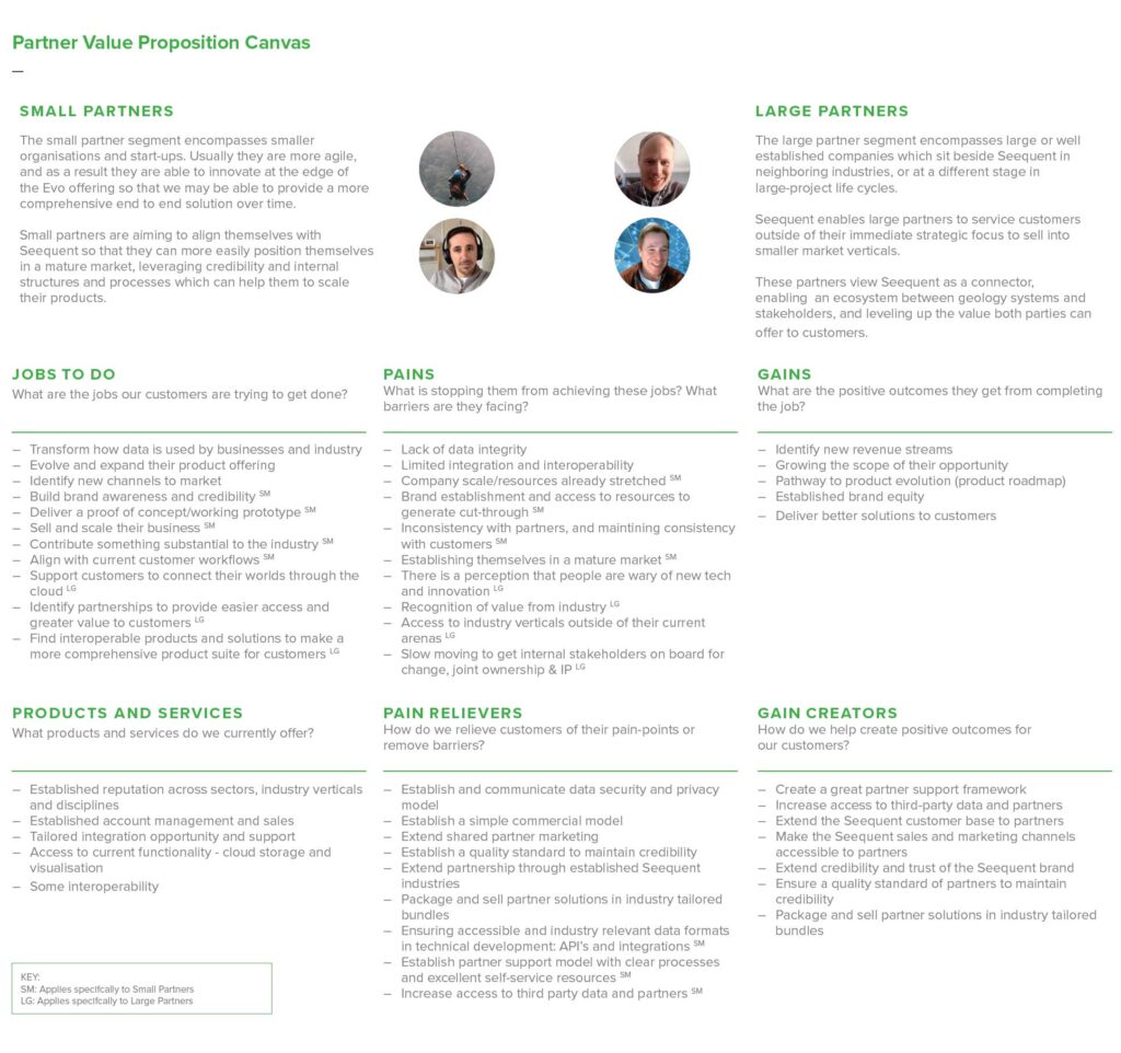
Partner Value Propositions
The partner segmentation transformed how we look at Evo partners – from alliance, integration, and resellers to an approach which categorises partners based on their commercial reciprocal relationship with Evo.
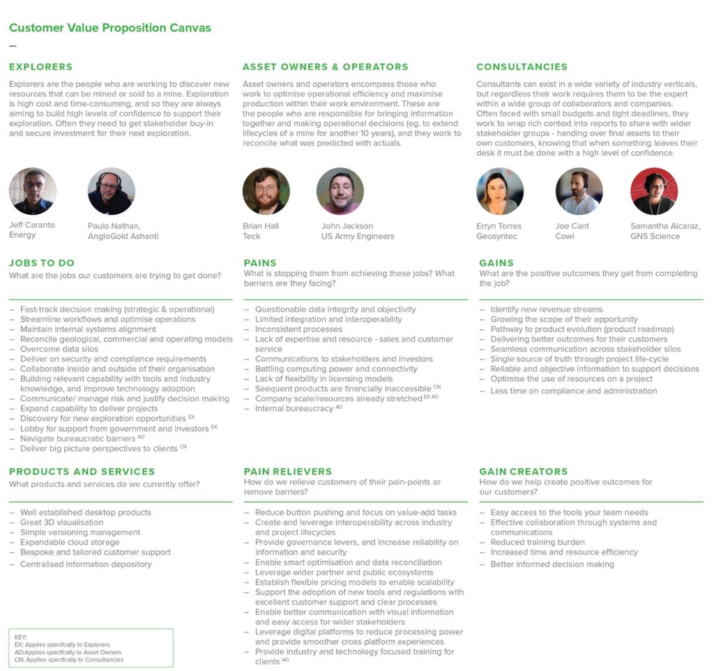
Customer Value Propositions
The customer segmentation framework shifted from focusing on industry verticals to customer categories based on behavioral traits of role types, and the jobs that they are trying to get done.
Ideation
Task user matrix
The general flow of the product as it is build & used within the ecosystem, this helped derive sections so that it could allow for simultaneous design and development of individual components. This helped the team view all stages of the flow on a higher level.
Lo-fi Wireframes
We created wireframes and carried out usability tests to determine if we were successful in the direction of our strategy and flows.
TradeWindow Product Design
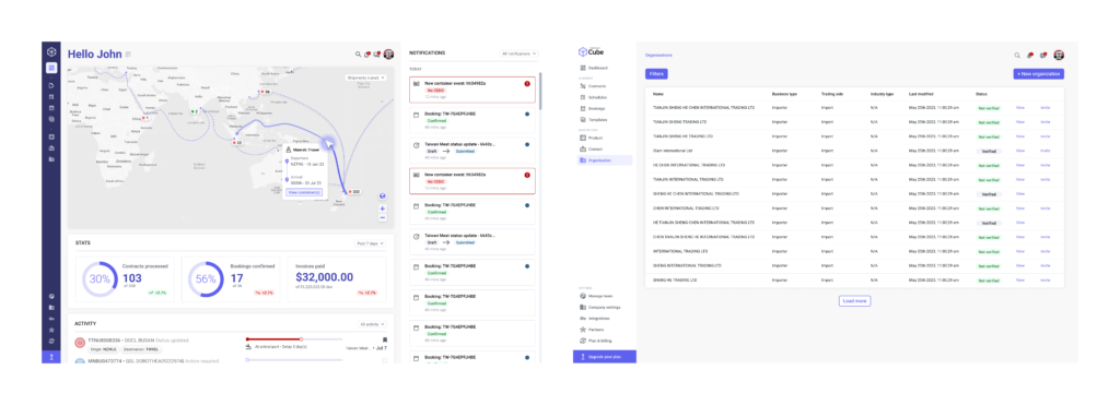
TradeWindow leverages software and industry expertise to provide more visibility and control, with the tools and support for exporters, importers, freight forwarders, and customs brokers to move away from inefficient trade processes and begin the journey to digital transformation, streamlining business processes and driving profitability.
What we were tasked with
I used my visual, interaction, and research skills to help TradeWindow to attain a product-market fit and scale its offerings. I then focused my attention on establishing, growing, and leading the UX discipline.
I designed a major version of TradeWindow’s provenance app as the product design lead. I helped reduce transaction and operational costs by providing greater user agency and control through design. I then built and managed a team of product, communication, research, and UI system.
I cannot show the majority of work I did at TradeWindow because of proprietary concerns. Below is a sample of some of the projects I directly worked on while leading design at TradeWindow.
Research
Focusing on user research
User research is crucial at TradeWindow because of the complex workflows of the many user types that must be accommodated to make the system work. One of the first things I did at TradeWindow was to get out of the building and interview clients.
I conducted user research sessions to derive product insights. I employed user interviews, contextual inquiry and analysis, persona development, card sorting, etc.
User Interviews
One of my most significant insights from interviewing and observing the many people comprising international logistics was that no one knows it all. Each knowledge worker has a depth of subject matter expertise and knows enough about adjacent roles to get their job done.
This insight drove the product design architecture of our system, connecting the dots between each user type. Instead of just designing for a primary user type and accommodating secondary types, each product designer builds for the intersection of a diverse chain of roles.
Personas
After we transcribed the interviews, segmented the audiences, we derived personae from the individuals that stood out as the main segments in each of the specified audiences.
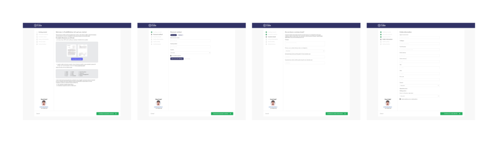
I started the project by reviewing all the known requirements with the product team. We agreed on business and user goals and began examining the common onboarding issues. I started to sketch ideas, while the product team further defined all the exceptions and unknowns.
We performed task analysis and defined the conditional flow. I then created a low-fidelity prototype and began to conduct usability tests.
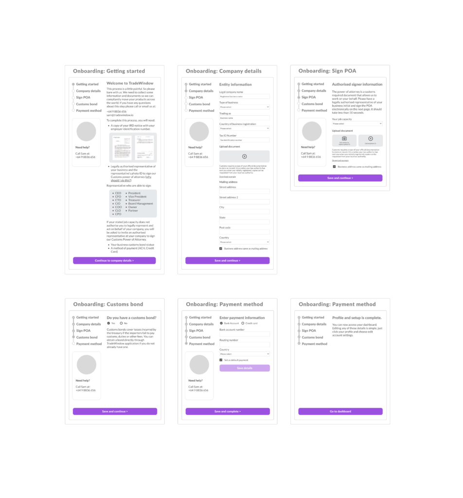
I iterated the design based on insights from usability tests, as well as new requirements for exceptional cases (ex. what if the user is apart of another organisation and doesn’t have access to key documents?).
I then created a high-fidelity prototype and conducted additional usability tests. Once we had high confidence in the new design, we began implementation. We then made countless tweaks to the compliance onboarding flow after its launch to accommodate unique use cases.
Business outcome
The redesign decreased friction by orders of magnitude. Before the redesign, the majority of users needed help from customer service to complete the process, and unique situations were facilitated by our internal teams.
The new design enabled users to become familiar with usability in a matter of minutes with a stepped process that accommodated many diverse company types through conditional flows. The redesign helped us to serve clients that were previously unprofitable due to onboarding costs.
View Project