
Exosphere
When I joined Fleet Space, ExoSphere was already capable of rendering subsurface data in 3D. From a technical perspective, it worked. Users could load surveys, explore spatially, and inspect measurements collected from the field. The system was performant, and the underlying data was accurate.
But the experience wasn’t helping users make decisions.
Each survey existed in isolation, visualised as a dense point cloud. To build a broader understanding of the subsurface, users had to move between views and mentally stitch everything together. What should have been a model felt more like a collection of disconnected snapshots.
The problem
Section titled “The problem”ExoSphere was not a single coherent system. It was a set of compartmentalised views.
Each survey was loaded and explored independently, often as a dense cloud of coloured points. There was no unified spatial context, no continuous model, and no clear way to understand how one dataset related to another.
At the same time, the primary visualisation method — point clouds — made interpretation difficult.
Users were looking at thousands of individual data points and trying to infer:
- where meaningful structures existed
- how continuous those structures were
- and how different surveys aligned
This created two overlapping challenges. The data itself was visually noisy. And the system was structurally fragmented.
What we learned from point clouds
Section titled “What we learned from point clouds”Point clouds are widely used in geospatial visualisation because they preserve raw data fidelity. Each point represents a measurement, and collectively they form a spatial representation of the subsurface. In theory, this provides maximum accuracy. In practice, it creates cognitive load.
Through working sessions with geoscientists and internal teams, it became clear that the issue wasn’t the data itself — it was how it was being expressed.

Users were trying to answer questions like:
- Where is the target zone?
- What shape does this structure take?
- How confident are we in this region?
While the answers existed within the data, the visualisation made them difficult to extract.
Patterns were buried in noise. Clusters did not resolve into clear forms. And small changes in perspective could significantly alter perception.
What made this more difficult was the lack of connection between datasets. Even when users could interpret a single view, they still had to reconcile it against separate surveys with no shared context. The system wasn’t just hard to read. It was hard to reason about.
Reframing the problem
Section titled “Reframing the problem”Once these issues were understood, the problem itself changed. This wasn’t simply a visualisation issue. It was a modelling problem.
Instead of asking:
How do we visualise each survey?
We started asking:
How do we represent the subsurface as a continuous, interpretable system?
This reframing shifted the focus from:
- isolated datasets → to connected understanding
- raw representation → to meaningful structure
Design direction
Section titled “Design direction”The redesign focused on two parallel shifts. First, we moved away from point-based representations toward surfaces and volumes that express structure more clearly. Second, we moved from isolated survey views to a unified spatial context where multiple datasets could be understood together.
This meant:
- representing data as continuous forms rather than discrete points
- aligning datasets within a shared coordinate space
- enabling comparison and layering across surveys
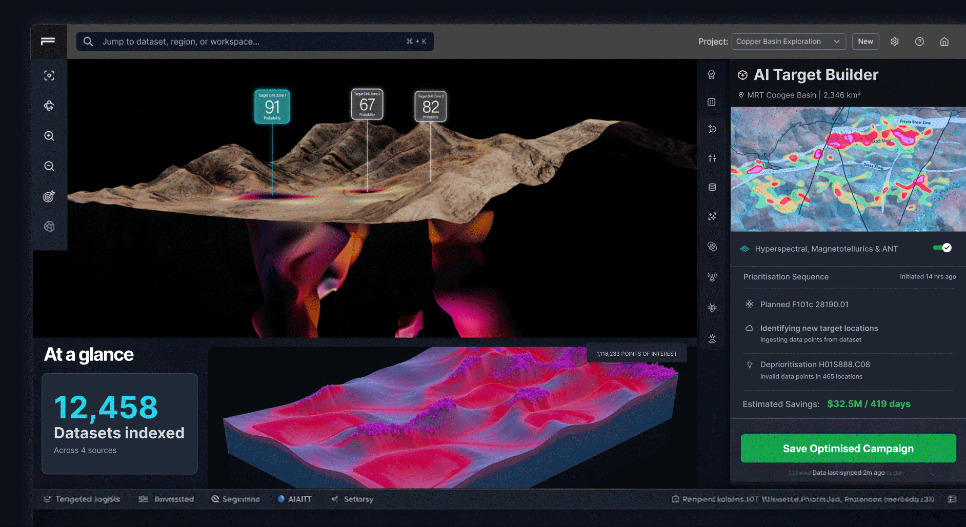
A coded exploration of continuous 3D terrain and target views, used to test whether users could reason about structure more easily than with fragmented point-cloud visualisations.
These approaches reduce noise and make patterns more visible.
Instead of asking users to interpret thousands of individual points, the system presents shapes, boundaries, and gradients that better reflect how geoscientists think about subsurface structures.
Interaction model
Section titled “Interaction model”The redesign also changed how users interact with the data. Rather than presenting static views, the interface supports active exploration. Users can:
- slice through volumes to inspect internal structure
- adjust thresholds to refine what is visible
- toggle layers to compare datasets
- and isolate regions of interest
Each interaction is designed to answer a question. Not just manipulate a model.
Design system
Section titled “Design system”To support this shift, I established a new visual and interaction system for ExoSphere.
This included:
- a consistent layout for combining 3D views with controls
- clear hierarchy between data layers and UI elements
- interaction patterns for filtering, slicing, and exploration
- and a visual language for expressing confidence and structure

The goal was to ensure that as the product evolved, the experience remained coherent — even as complexity increased.
What changed
Section titled “What changed”This work included a full redesign of the 3D viewer. The interface was restructured, the visual system was replaced, and new interaction patterns were introduced. While this could be described as a UI refresh, the impact was deeper.
It changed how users:
- interpret spatial data
- understand relationships between datasets
- and make decisions about where to act
Outcomes
Section titled “Outcomes”The impact of this shift was both visual and cognitive. Users no longer had to reconstruct relationships between surveys manually.
Instead, they could:
- see how datasets align within a shared model
- identify structures across multiple inputs
- and act with greater confidence
The system moved from:
- fragmented views → to connected insight
- raw data → to interpretable structure
Users spent less time figuring out what they were looking at, and more time deciding what to do next.
Reflection
Section titled “Reflection”This project reinforced something that applies beyond geoscience. More data does not lead to better decisions. Better representations do. The challenge was never about rendering capability.
It was about helping users move from seeing data → to understanding it.