Central Viewer
Geological teams rely on 3D models to understand subsurface conditions, review interpretations, and make decisions that affect drilling, planning, and investment. The problem was that most of that work still lived inside specialist desktop software: powerful for experts, but slow to share, hard to review together, and inaccessible to the wider set of stakeholders who also needed to understand what the model was saying.
This project explored how a cloud-based 3D viewer could make geological models easier to access, navigate, review, and discuss without forcing users back into desktop-only workflows. The challenge was not simply technical rendering in the browser. It was product design: how to make complex geological information feel usable, collaborative, and trustworthy in a very different environment.
This project focused on rethinking geological model review for the cloud. Seequent already had strong desktop tools for building and analysing subsurface models, but the experience of sharing, reviewing, and collaborating around those models was still too dependent on specialist software, local files, and slow handoffs. That created friction for both technical and non-technical users. Geologists could interpret the data, but broader teams often struggled to access the latest model state, understand revisions, or discuss findings in context.
The opportunity was to design a viewer that did more than display 3D geometry in the browser. It needed to support real product behaviour: project navigation, object management, commenting, scene-based collaboration, revision awareness, and enough interaction clarity that users could move through the experience without feeling trapped inside an expert-only tool.
Discovery & Framing
Section titled “Discovery & Framing”Geological modelling workflows had traditionally been shaped by desktop software. That made sense for model creation and high-performance technical work, but it came with obvious constraints once a model needed to be reviewed, discussed, or shared more broadly. Files moved slowly. Versions drifted. Comments lived in screenshots, emails, or meetings rather than alongside the model itself. Stakeholders who were not deep in the tooling often depended on someone else to mediate the experience for them.
The Problem Space
Section titled “The Problem Space”The real problem, then, was bigger than browser rendering. The viewer needed to support a shift from individual access to shared understanding. It had to make geological models easier to open, easier to orient around, easier to annotate, and easier to discuss as living project artefacts rather than static exports.
Desktop tools assume a certain kind of user: highly trained, highly motivated, and willing to tolerate complexity in exchange for capability. A web-based viewer created a different expectation. It needed to work for expert users who wanted control, but also for occasional collaborators, executives, and technical stakeholders who needed confidence and context more than endless controls.
That created a set of tensions that shaped the design:
- depth versus accessibility
- precision versus usability
- model complexity versus navigational clarity
- individual analysis versus shared collaboration
- browser constraints versus expectations set by desktop software
Who this needed to support
Section titled “Who this needed to support”Technical users reviewing models
Section titled “Technical users reviewing models”Geologists and specialists needed to inspect formations, structure, and object properties without losing the depth of the original workflow.
Project collaborators
Section titled “Project collaborators”Teams needed to share scenes, comment on a point of interest, and move through the same context together instead of passing screenshots around.
Decision-makers
Section titled “Decision-makers”Wider stakeholders needed to understand what the model was saying without becoming experts in the software itself.
Distributed teams working across revisions
Section titled “Distributed teams working across revisions”The product needed to help people stay oriented across versions, updates, and revision history when the underlying model changed.
What I learned in discovery
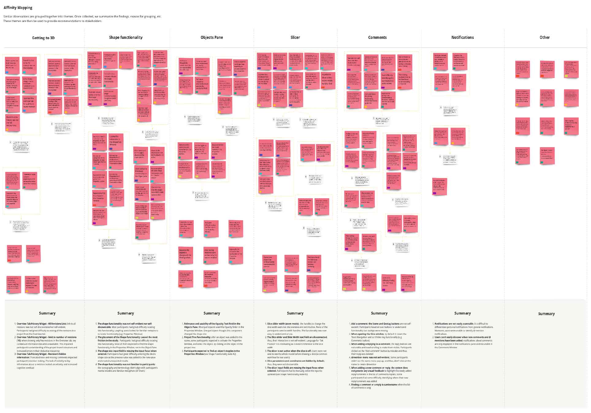
Section titled “What I learned in discovery”The research and workshop material pointed to a few recurring themes.
Users did not just need access to the model. They needed help getting to the right part of the model. They needed better orientation inside 3D space, clearer relationships between project structure and scene content, and more confidence around what actions applied to which objects.
There was also a strong collaboration gap. Comments, revisions, and notifications were either too disconnected from the model or too weakly integrated into the browsing experience. If Central Viewer was going to be genuinely useful, collaboration had to feel native to the product rather than layered on afterwards.
Design & Validation
Section titled “Design & Validation”Once the problem was framed properly, the design work became less about “what controls should a viewer have?” and more about “how should this product help people move through technical review and discussion?” That shift mattered. It led to a set of design moves that were structural, not just visual.
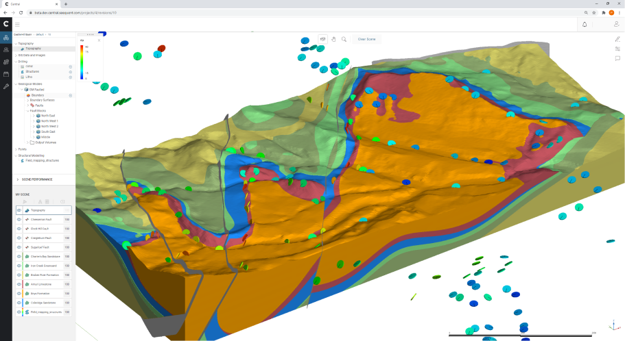
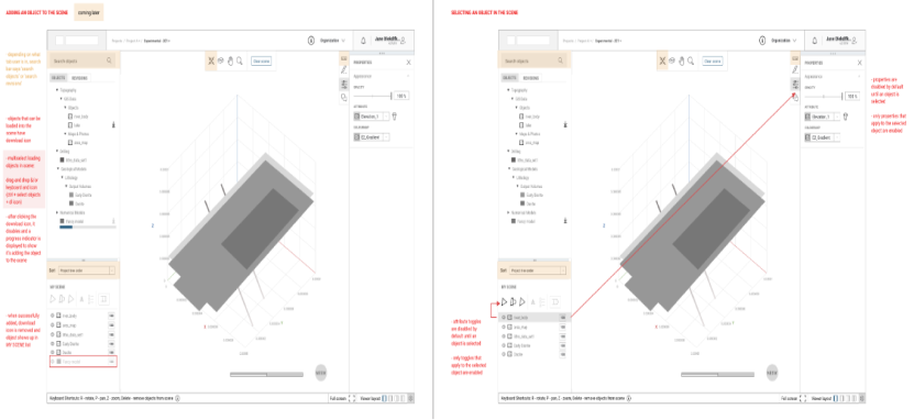
Restructuring the viewer around the work
Section titled “Restructuring the viewer around the work”A key part of the solution was reorganising the interface so the product tree, scene state, and object-level controls felt more coherent together. In desktop tools, users often tolerate fragmentation because they are deeply trained in the environment. In a web product, that fragmentation becomes much more visible.
So I explored different panel arrangements, object browsing patterns, and property layouts to reduce unnecessary distance between what users were looking at in the scene and what they could act on in the interface.
The challenge here was balance. Too much visible UI and the product felt crowded and intimidating. Too little and users lost control. The final direction aimed to create a clearer relationship between:
- the project tree
- the active scene
- object selection
- attribute and property controls
- actions related to commenting and collaboration
This made the product feel less like a technical wrapper around a 3D canvas and more like a usable review environment.
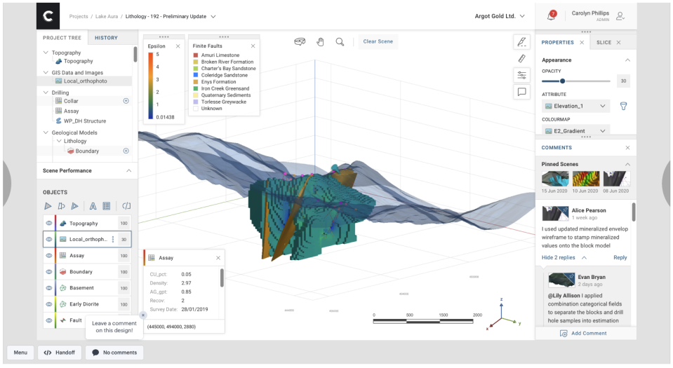
Making collaboration native, not bolted on
Section titled “Making collaboration native, not bolted on”This was one of the most important design directions in the project.
If users still had to leave the product to discuss what they were seeing, then the viewer remained only partially useful. The collaboration model needed to support shared scenes, comments, navigation to a point of interest, and better awareness of revisions and updates.
That meant thinking beyond markup as a feature and toward collaboration as a workflow.
The interface had to help users:
- capture a view worth discussing
- direct someone else to the same context
- understand what changed between revisions
- stay oriented when comments, scenes, and project structure intersected
This was especially important in distributed teams, where the value of the viewer was not just opening a model in-browser, but reducing the lag between interpretation and discussion.
Simplifying specialist workflows without flattening them
Section titled “Simplifying specialist workflows without flattening them”The hardest part of the project was not making the viewer simple. It was making it legible.
Geological review contains real complexity. Multiple objects may be active. Selection states matter. Properties behave differently depending on what is selected. Scene controls, slicing, opacity, and attribute display all affect how a model is interpreted. Hiding that complexity entirely would not have helped serious users. But exposing it without structure would have recreated the same intimidation the browser experience was meant to reduce.
The work therefore focused on reducing unnecessary friction rather than reducing domain depth. Multi-select behaviour, property controls, scene interactions, and object visibility all needed to feel clearer and more predictable, especially when users were moving between inspection and collaboration.
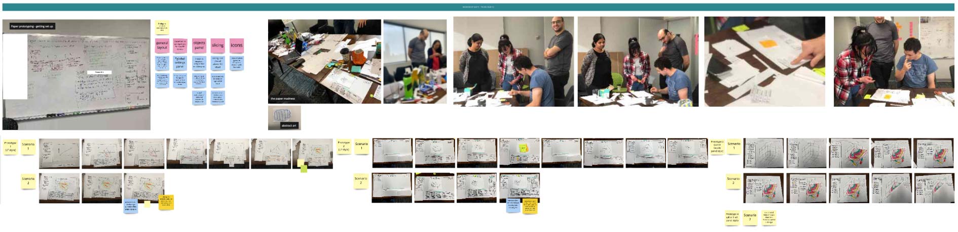
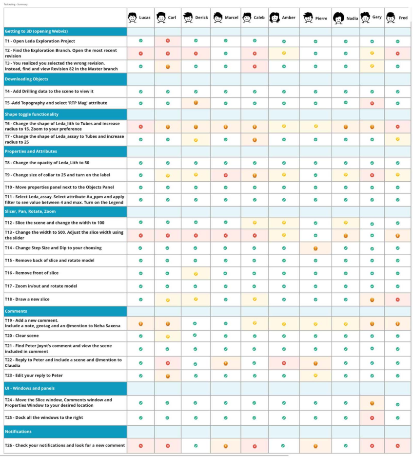
Testing and iteration
Section titled “Testing and iteration”Testing helped validate where the product felt intuitive and where it was still carrying too much desktop baggage. The team used workshops, evaluative review, and usability sessions to examine comfort with the new layout, discoverability of actions and controls, collaboration features such as comments and scene sharing, object pane and slicer behaviour, multi-select expectations, and revision visibility.
This research was useful not just for tactical refinements, but for confirming a broader design principle: users were more confident when the interface made the relationship between scene, structure, and action easier to understand.
Outcomes & Reflection
Section titled “Outcomes & Reflection”Central Viewer helped establish a stronger product direction for cloud-based geological review. It moved the conversation beyond “can we render this in the browser?” and toward “how should teams actually work together around a live geological model?” That was the more important shift.
The project clarified how cloud viewing could support not just access, but collaboration, orientation, and more timely decision-making across a wider group of users. It also created a foundation for a more connected experience around scenes, comments, revisions, and in-context navigation, all things that matter when technical work needs to be reviewed and discussed, not just displayed.
What this enabled
Section titled “What this enabled”- A clearer path from isolated desktop review to shared cloud-based collaboration
- Better navigation between project structure, scene context, and object-level actions
- A more usable interaction model for both expert and occasional users
- Stronger support for comments, revisions, and collaborative geological review
- A product story centred on accessibility, trust, and workflow clarity rather than browser novelty
Reflection
Section titled “Reflection”This project reinforced something I still care deeply about: specialist software does not become better by pretending the work is simple. It becomes better when the complexity is structured well enough that people can move through it with more confidence.
Central Viewer was important because it treated the browser not as a downgrade from desktop, but as an opportunity to rethink the experience around collaboration, visibility, and shared understanding. The result was not just a new way to view geological models. It was a more usable way to work around them together.