
Assure+
Assure+ was a traceability product with a deceptively difficult design challenge.
On the surface, it looked like a multi-platform interface problem: an admin portal, a field app, and a public-facing provenance page all needed to feel like part of the same product. But underneath that was a deeper systems question. How do you create one coherent design language across three very different contexts, with different users, different pressures, and different expectations, without forcing them into the same shape?
That was the real work.
My role was to lead the UX design of a shared system that could hold together the product across platforms while still respecting the distinct needs of each surface. The outcome was not just a cleaner visual language. It was a stronger, more scalable foundation for how Assure+ behaved as a product.
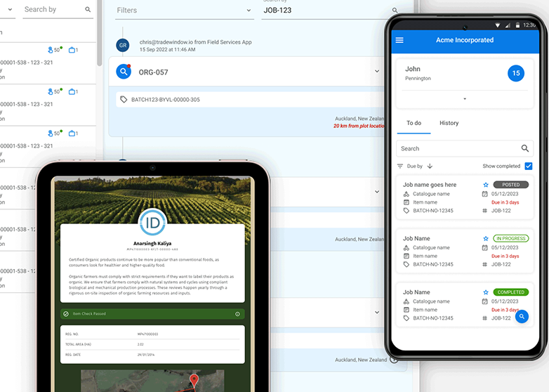
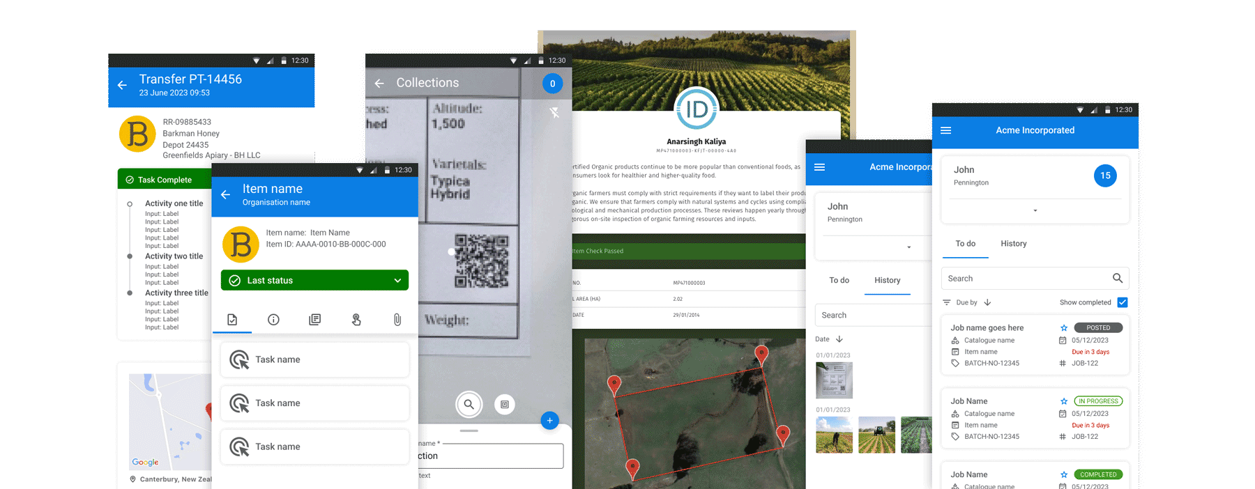
Assure+ supported supply-chain integrity and traceability through a combination of administrative workflows, field-based interactions, and public-facing provenance information. Each part of the product served a different audience.
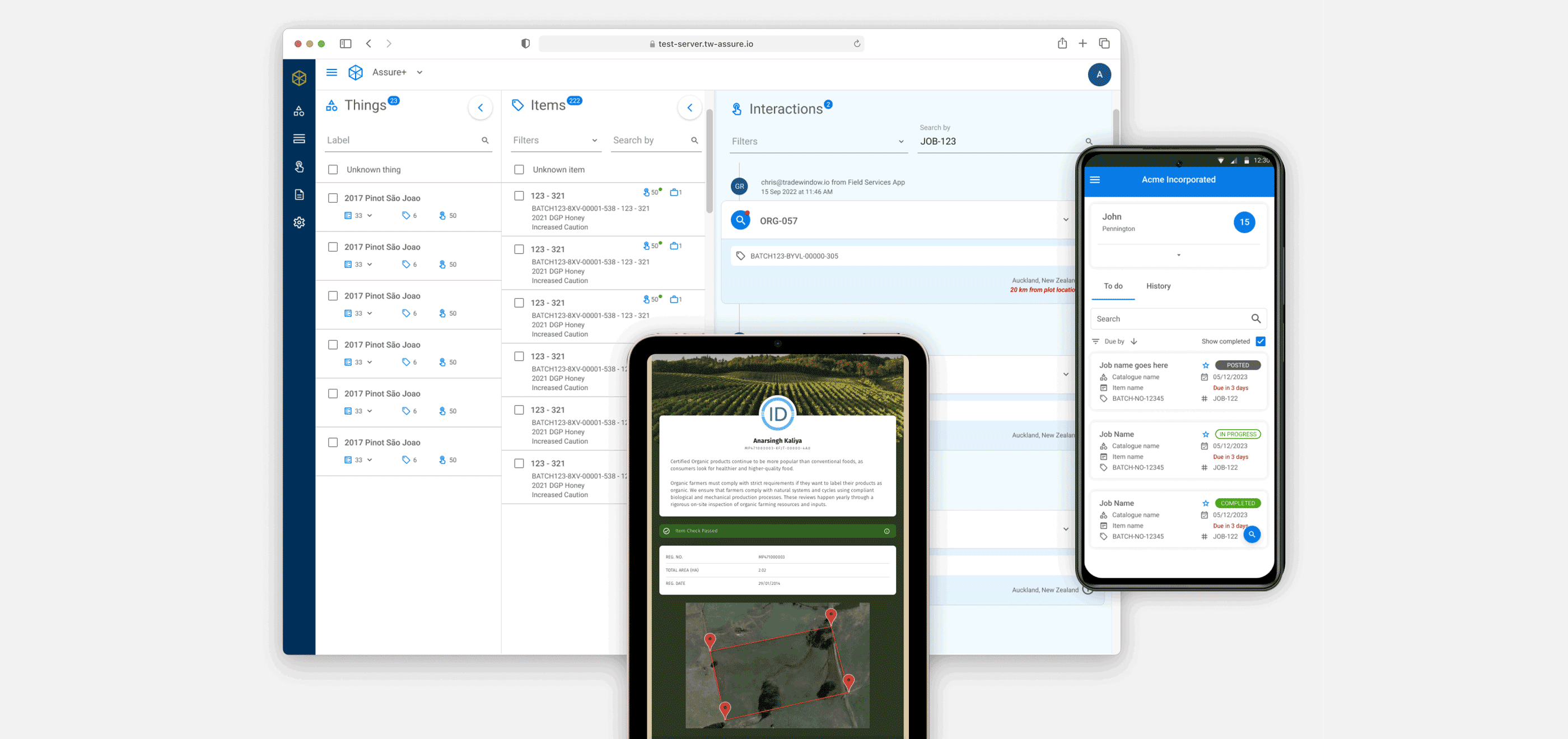
The admin portal needed to support structured management of items, jobs, tasks, interactions, and operational records. The field app needed to work for users on the go, often under time pressure and in less-than-ideal conditions. The public-facing page needed to present provenance information clearly and credibly without exposing users to the complexity of the internal system.
Those are not minor variations of the same interface. They are different product contexts.
The challenge was to create a design system that could unify the product without over-standardising it. The system needed to provide consistency, recognisability, and reusability while still allowing each platform to behave appropriately for its users and environment.
1. Discovery & Framing
Section titled “1. Discovery & Framing”The easiest mistake on a project like this is to think the problem is visual inconsistency.
That is usually only the symptom.
The more important issue is structural inconsistency: different patterns for similar actions, different interaction expectations across surfaces, uneven component logic, and a product that starts to feel fragmented because each platform evolves in isolation. That fragmentation creates design debt, development inefficiency, and a weaker user experience.
In Assure+, the design system needed to solve for more than aesthetics. It needed to create a coherent product model.
One product, three very different contexts
Section titled “One product, three very different contexts”The product had three distinct surfaces:
-
an admin portal for managing supply-chain data and workflows
-
a mobile field app for task execution and reporting in operational contexts
-
a public provenance experience for viewing traceability information
Each had very different needs.
The portal needed density, control, and efficient navigation through structured information. The field app needed speed, clarity, and resilient interactions for users working away from desks. The provenance page needed simplicity and trust, translating complex supply-chain information into something legible to external audiences.
That meant the design system could not simply enforce uniformity. It had to provide a shared foundation while allowing for contextual variation.
Consistency was important, but sameness would have been a mistake
Section titled “Consistency was important, but sameness would have been a mistake”This became one of the central framing decisions in the work.
A good cross-platform system should make the product feel related, not identical. Shared typography, colour logic, spacing principles, components, and interaction rules create familiarity. But the exact expression of those things should still respect the job being done.
The admin portal, for example, needed denser information structures and more persistent navigation. The field app needed more direct task flows, stronger touch targets, and clearer action prioritisation. The public page needed to reduce internal complexity and focus on trust, provenance, and readability.
The system therefore had to distinguish between:
-
what should be standardised
-
what should be adapted
-
what should remain platform-specific
That distinction is what made the design system useful rather than rigid.
2. Design System Strategy
Section titled “2. Design System Strategy”Once the problem was framed properly, the work became less about creating isolated screens and more about defining a durable system.
The goal was to build a shared language that designers and developers could use across the product — one that supported consistency in the fundamentals while still leaving room for each platform to behave appropriately.
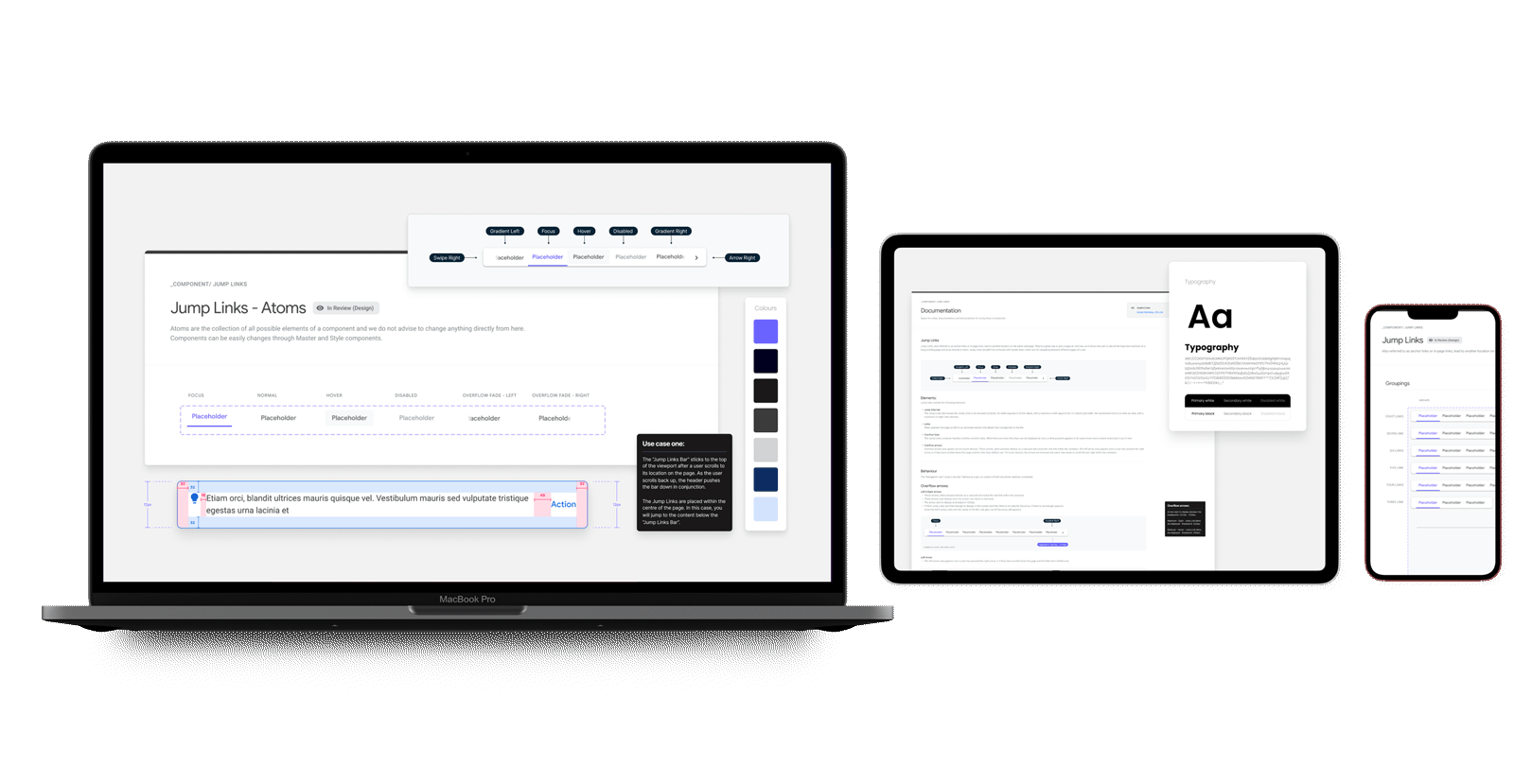
Building the foundations first
Section titled “Building the foundations first”The system work focused on the layers that shape product coherence over time:
-
colour roles and hierarchy
-
typography and scale
-
spacing and layout logic
-
component structure
-
state behaviour
-
interaction patterns
-
responsive and platform-specific guidance
This mattered because consistency is not created by copying screens. It comes from agreeing on the rules underneath them.
The more clearly those rules are defined, the easier it becomes to design new features, extend the product, and maintain recognisable behaviour across contexts.
Components were only one part of the system
Section titled “Components were only one part of the system”It is tempting to describe a design system in terms of buttons, inputs, tables, and cards. Those things matter, but the stronger value came from the logic around them.
The system needed to answer practical questions such as:
-
how should information density change across surfaces?
-
when should navigation remain persistent versus collapse?
-
how should actions be prioritised in mobile versus desktop contexts?
-
what states need to remain visually recognisable across all platforms?
-
how should internal product complexity be simplified for the public-facing provenance view?
Those questions shaped the system far more than a component inventory ever could.
Designing for reuse without designing for repetition
Section titled “Designing for reuse without designing for repetition”A useful system should reduce waste, not produce clones.
So rather than trying to force the exact same UI patterns everywhere, the system was designed to support reuse at the right level. Shared principles and shared building blocks created continuity, while layout, information hierarchy, and interaction flow could still respond to the needs of each platform.
That made the system more scalable and more believable to the teams using it.
3. Cross-platform Design In Practice
Section titled “3. Cross-platform Design In Practice”The most interesting part of Assure+ was seeing how the same product language had to stretch across genuinely different interfaces.
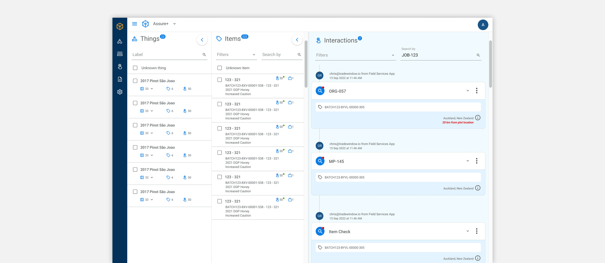
Admin portal: density, clarity, and control
Section titled “Admin portal: density, clarity, and control”The portal needed to support users managing structured supply-chain records, items, interactions, tasks, and jobs. That meant designing for higher information density without letting the interface become visually noisy or cognitively heavy.
The design system supported this through:
-
clearer table and list structures
-
reusable filtering and search patterns
-
consistent detail panels and drill-in behaviours
-
stronger hierarchy between navigation, content, and actions
The result was a more stable foundation for operational work, where users could scan, manage, and move through records without every screen needing to reinvent itself.
Field app: speed, focus, and action under real conditions
Section titled “Field app: speed, focus, and action under real conditions”The field app had a different problem set. Users were not sitting comfortably at a desk exploring admin structures. They were carrying out tasks, reviewing jobs, capturing information, and moving through workflows in the field.
That meant the system needed to prioritise:
-
simplified task flows
-
large, clear interaction targets
-
stronger emphasis on current actions
-
portable information hierarchy
-
responsive behaviour across iOS and Android
The field experience was not just a smaller version of the portal. It was a focused operational tool, and the design system had to recognise that.
Public provenance page: clarity and trust
Section titled “Public provenance page: clarity and trust”The public-facing provenance page had yet another role. It needed to communicate traceability information in a way that felt credible, understandable, and lightweight. Users here did not need to navigate internal product structures. They needed to understand where something came from and why that information could be trusted.
That changed the design priorities.
The system had to simplify without becoming vague. It had to carry the same product identity while stripping away internal complexity. In that sense, the public page became a good test of whether the design system was genuinely coherent or merely internal-facing.
Designing shared patterns that could flex
Section titled “Designing shared patterns that could flex”A large part of the value came from defining patterns that worked across contexts but could flex in expression.
This included:
-
card and list logic
-
form structures
-
state handling
-
action patterns
-
side panels and detail views
-
task and job interactions
-
content hierarchy for different screen sizes
This is where cross-platform design systems either become helpful or become restrictive. Assure+ needed the former.
4. Prototyping, Refinement, and Handoff
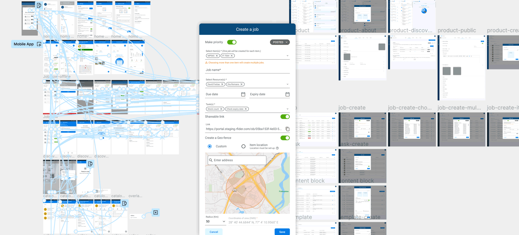
Section titled “4. Prototyping, Refinement, and Handoff”The system did not emerge fully formed. It was developed through active design exploration, prototyping, and collaboration with product and engineering.
Prototypes as alignment tools
Section titled “Prototypes as alignment tools”Prototyping helped test not only individual screens, but the consistency of the system itself. It made it easier to see where shared patterns held up, where they broke down, and where a component or interaction needed to change to work across different surfaces.
This also made conversations with engineering more concrete. Rather than discussing abstract consistency, the team could review how patterns behaved in real flows and across real use cases.
Handoff as system enablement
Section titled “Handoff as system enablement”Because the project involved a shared design system, handoff was not just about final screens. It was about giving the development team a structure they could actually use.
That included:
-
component guidance
-
interaction patterns
-
style and usage rules
-
platform-specific considerations
-
enough clarity that future work could build on the system rather than drift away from it
This is an important but often under-described part of design system work. A system only becomes valuable when it changes how the product is made, not just how it is presented.
5. Outcomes & Reflection
Section titled “5. Outcomes & Reflection”Assure+ became a stronger, more coherent product because it stopped behaving like three adjacent interfaces and started behaving more like one product expressed appropriately across different contexts.
The system created a clearer visual and interaction language, improved continuity between portal, field, and public experiences, and made future product work easier to structure and scale. It also gave the team a more durable foundation for design and development collaboration.
What this enabled
Section titled “What this enabled”-
A unified product language across web, mobile, and public-facing surfaces
-
More consistent interaction patterns and visual hierarchy
-
Stronger foundations for scaling features without fragmenting the experience
-
Better collaboration between design, product, and engineering
-
A design system that supported real product work rather than existing as a disconnected library
Reflection
Section titled “Reflection”What I like about this project is that it shows a less glamorous, but extremely important, side of product design.
Design systems are often talked about as though they are collections of components. In practice, they are closer to product infrastructure. They determine how consistently the product can grow, how confidently teams can build, and whether different surfaces feel meaningfully connected or quietly improvised.
Assure+ was valuable because it treated the design system as part of the product strategy, not just the finishing layer. The work was not about making everything look the same. It was about building enough shared structure that the product could remain coherent while still serving very different users in very different contexts.
That is what good system design does.
It gives a product room to grow without losing itself.